Revlon II: Color Promotions and the Power of Advertising
Welcome to all new subscribers! Substack included the first essay in my Revlon series in their Substacks Reads newsletter this week, leading many new subscribers to my little fashion and cultural history corner of the internet. Please go back through and read the archive, visit my Instagram (where I am always posting images and films from my research), and consider becoming a paid subscriber to support my work and receive all newsletters.
For more on Revlon, check out my articles on their “Fire and Ice” campaign and the House of Revlon salon.
As laid out in the previous newsletter, smart advertising and marketing had helped Revlon go from a tiny start in 1932 to a multi-million-dollar company by 1938. Expanding their line in the early 1940s to include lipsticks, and then face makeup and skincare, further enhanced their profits and prestige. All of these products were lavishly advertised, but none were more important that the matching lipstick and nail colors that were spotlighted in “full-scale color promotions.”
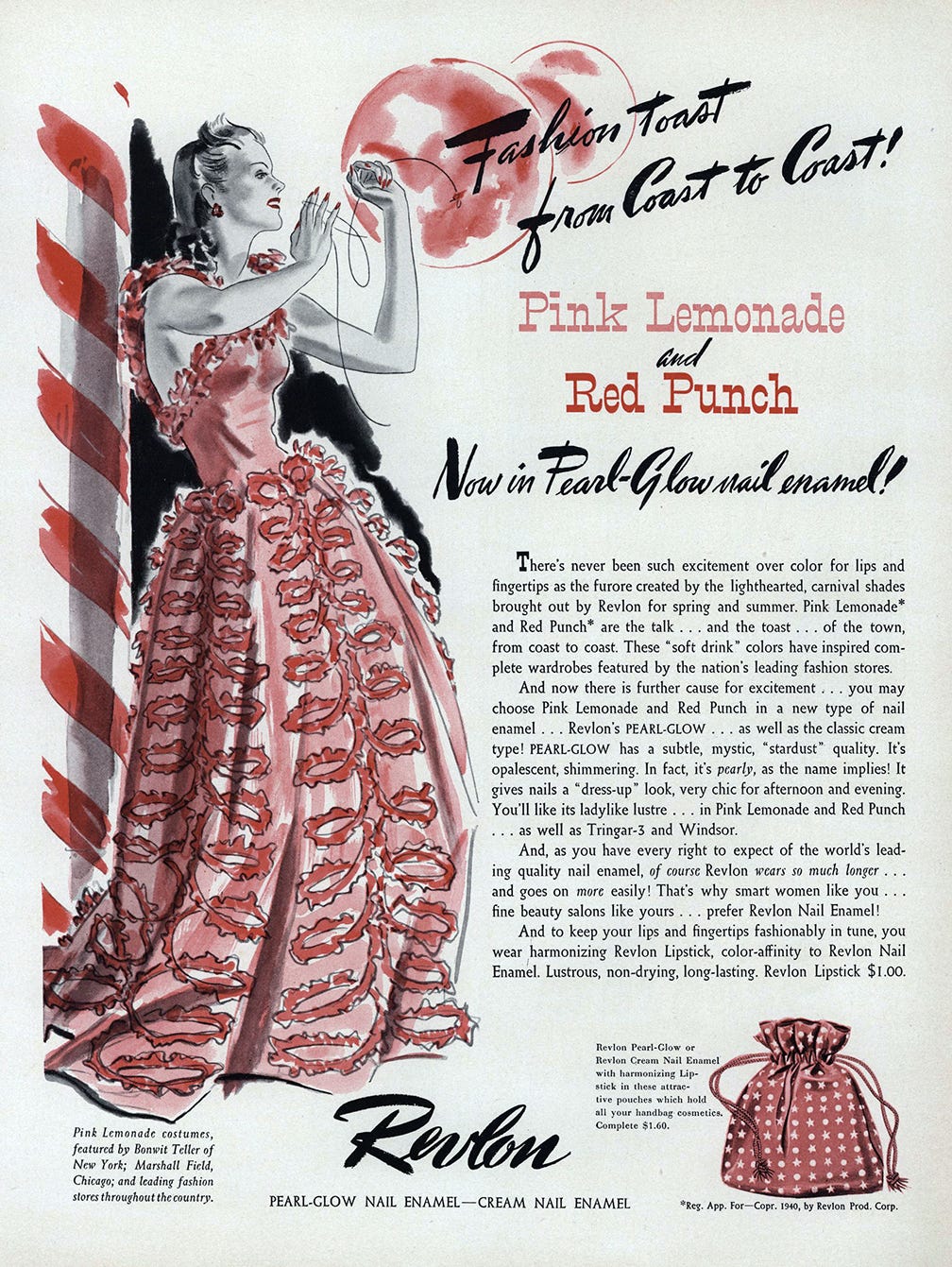
According to Andrew Tobias in Fire and Ice, Revlon’s first full-scale color promotion was for Pink Lightning in 1944. It is unclear exactly the extent of difference between Pink Lightning and some of the promotions that came earlier. Pink Lemonade in 1940, for example, was used to inspire a group of fashions featured in Vogue and sold at Bonwit Teller and Marshall Field (see above). In early 1944, Bonwit’s devoted their windows to “rosebearing” hats tying in with Revlon’s latest Tournament of Roses line. These promotions, while illustrating a crossover from cosmetics to fashion, appear to have been restricted to small collections—Pink Lightning making a broader sweep across department stores. At Harzfeld’s in Kansas City the promotion was “storewide and includes inexpensive dresses, better dresses, formal clothes, junior clothes. Furs and sportswear and shoes are also coordinated with this color promotion.” The windows were all themed as well: “The windows have pink paper backgrounds, stylized clouds of tissue paper and pink painted tree branches to which roses are attached…To give a lightning effect, spotlights in the windows are equipped with automatic blinkers.” Nettie Rosenstein designed some two-tone costumes to harmonize with the two different shadings of Pink Lightning—light electric pink for lips and a very intense blue-pink for nails. For the first time, Revlon also produced a complementary Pink Lightning powder in a soft cloudy pink.
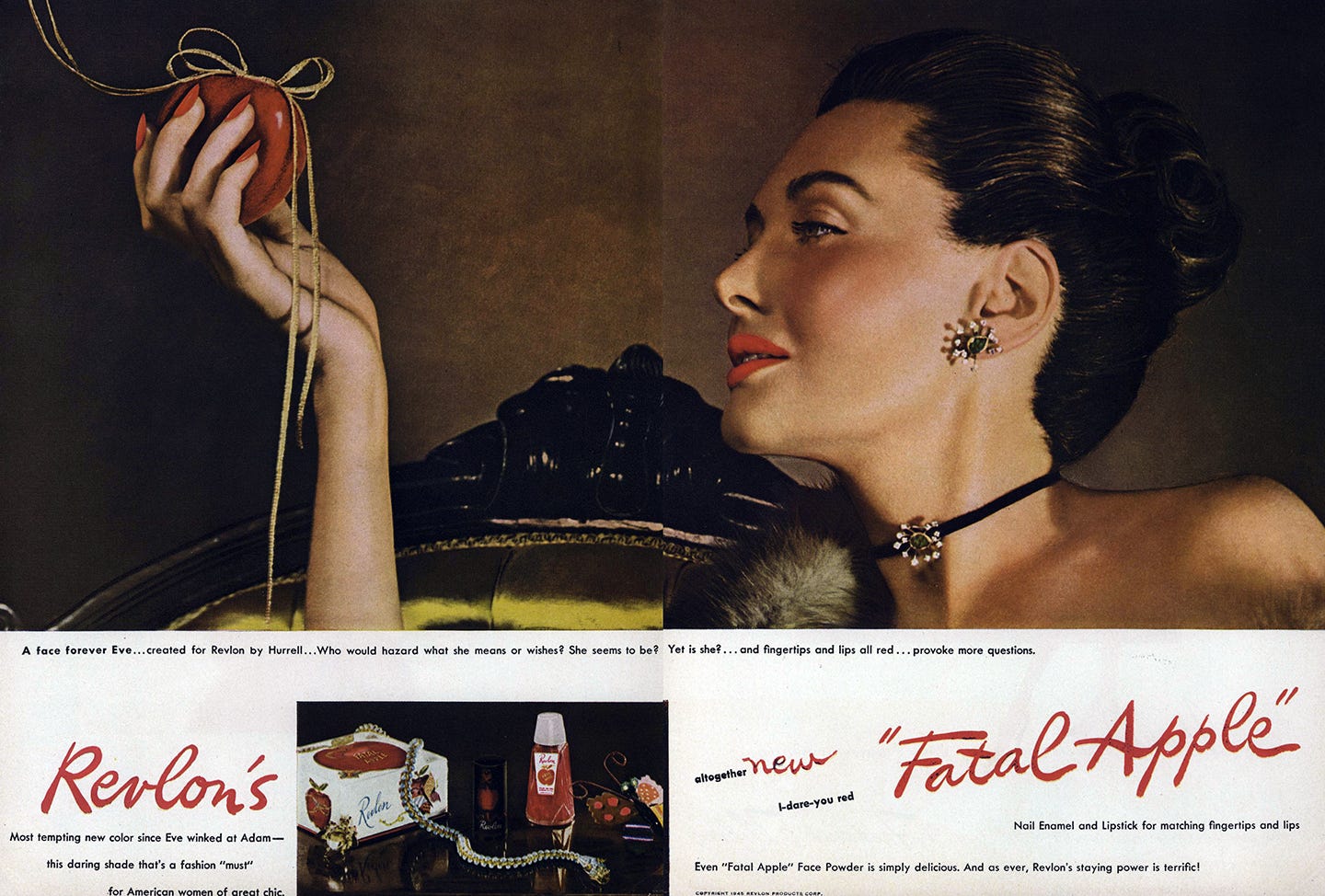
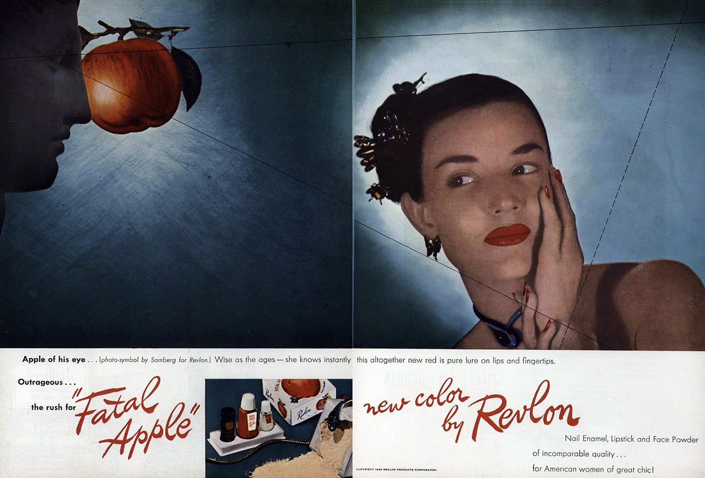
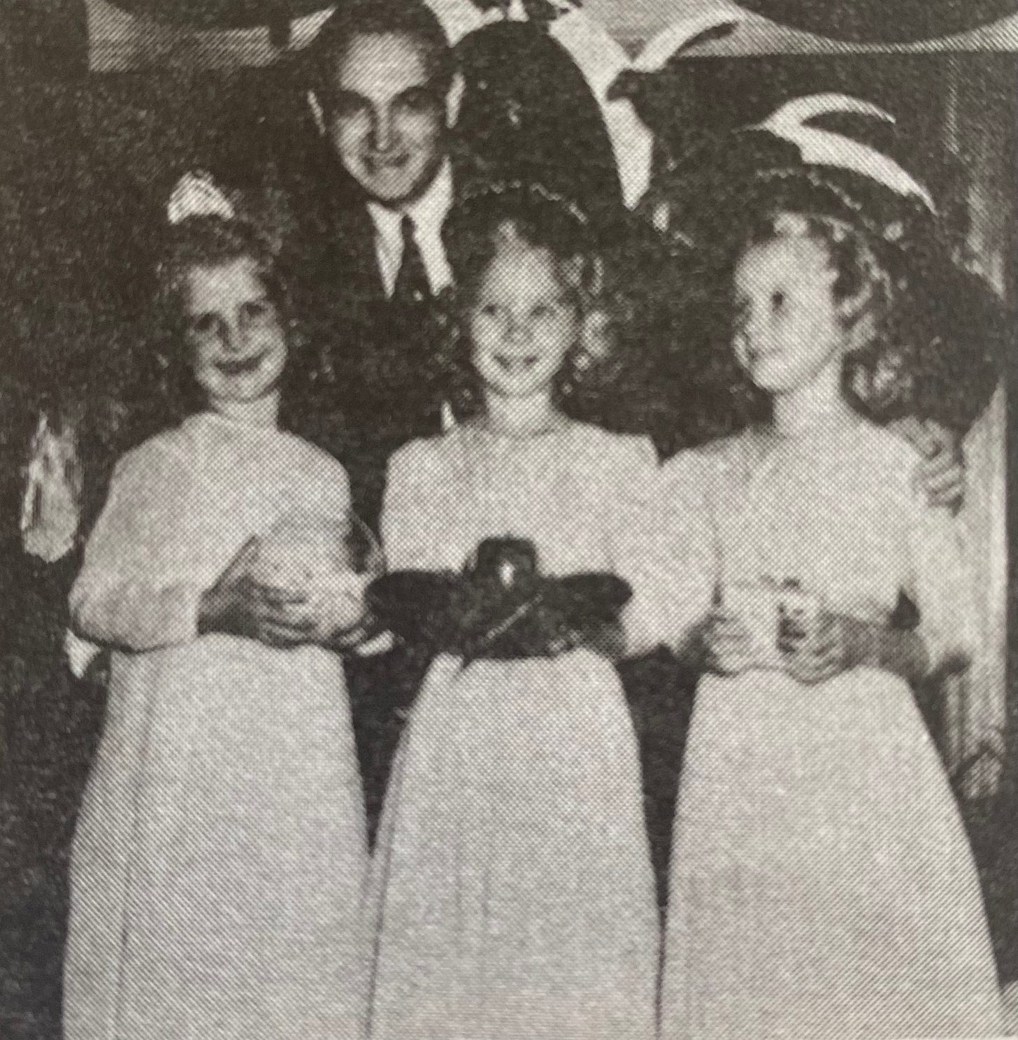
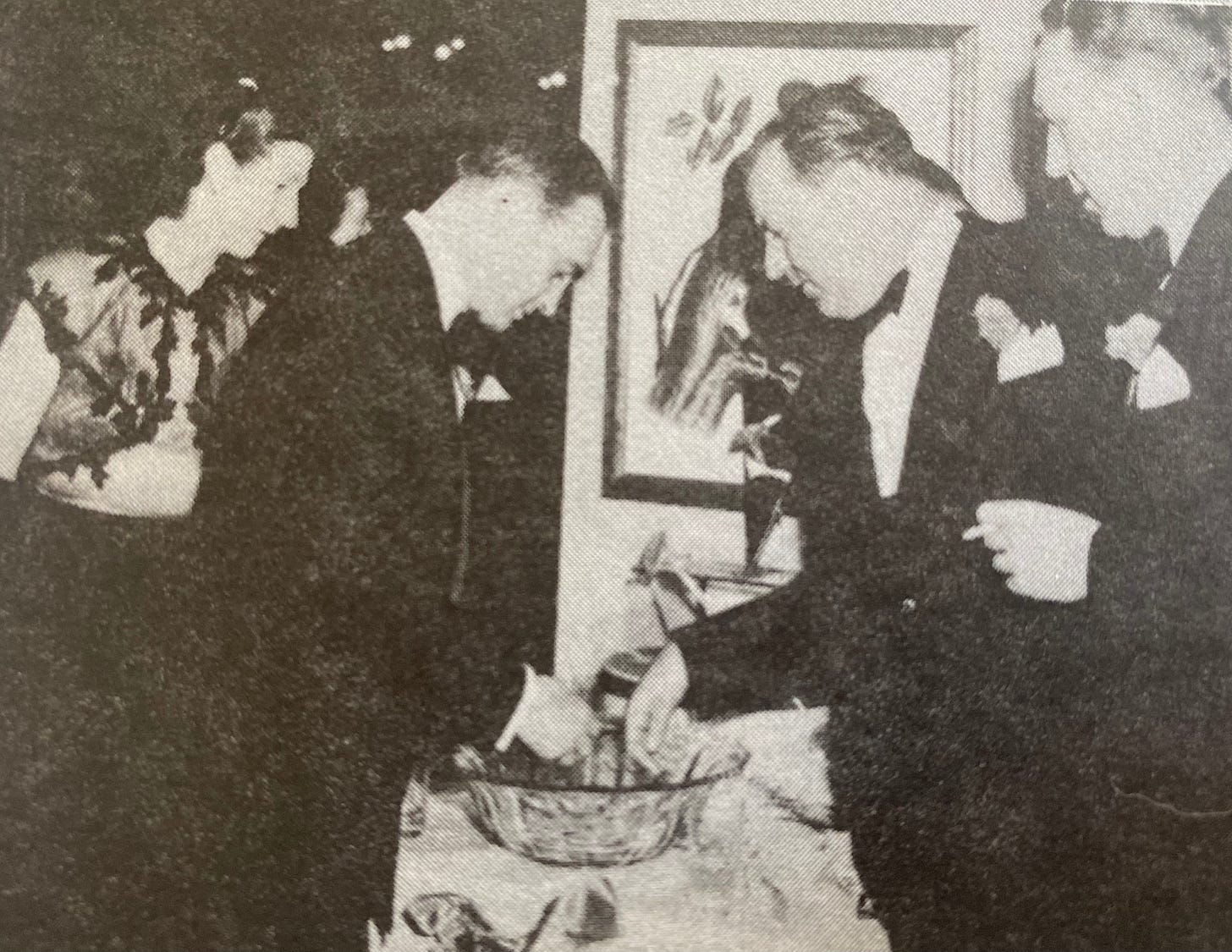
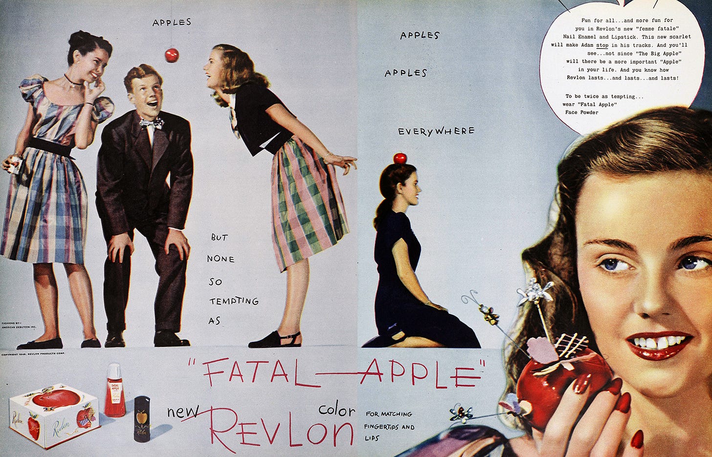
For the next major color promotion, Fatal Apple in 1945, Revlon looked to the book of Genesis to create “the most tempting color since Eve winked at Adam.” Widely advertised with lush color spreads, Fatal Apple also blanketed department store window displays nationwide. Revlon redecorated their showroom to match, while their publicity director Bea Castle put on the press party to end all parties—it “…featured not only Maurice the Mindreader, but also a snake and snake charmer from the William Morris Agency, a hollow gold apple door prize from Cartier, a grove of miniature apple trees from the Washington State apple-growers’ association, and fashions from Forever Eve.” More than just a cocktail party, New York’s top editors were served a dinner of lobster and rice, meatballs and spaghetti. Revlon also sponsored a debutante ball in Atlanta, where “the ballroom of the Biltmore hotel was transformed into the present day conception of the Garden of Eden by means of real grass, growing herbs and gorgeous blossoms in full bloom, to say nothing of a tremendous apple tree laden with shiny apples…” After dinner “the debutantes ‘bobbed for apples’ in a large crystal bowl. The lucky deb who speared the ‘Fatal Apple’ found inside a 14-karat gold lipstick in a handsome leather case as her prize.” Charles Revson hosted the event.
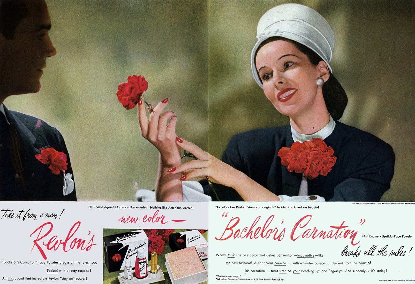
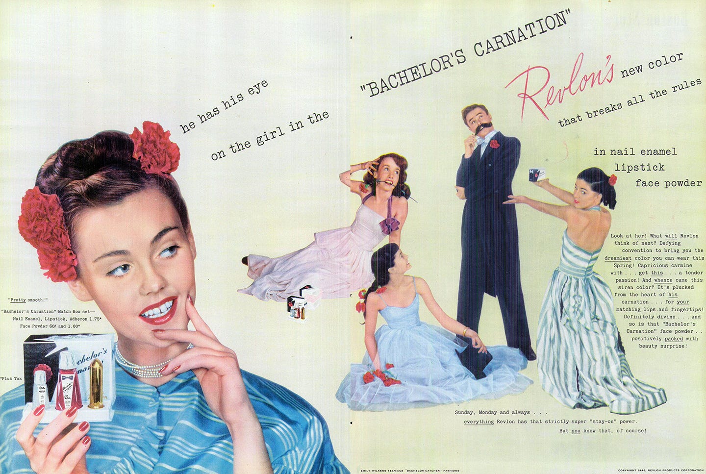
With men returning home from the war, Revlon launched Bachelor’s Carnation with a press party at the Pierre’s Cotillion Room on March 25, 1946: “Arriving guests greeted by Eton-suited pageboys dispensing favors from piled-high white flower cart…beautiful mannikins, dressed in ‘beau-catcher’ fashions inspired by the new color, tucking a fresh carnation in every male lapel… Prizes awarded in drawings were solid gold Revlon lipstick for femme winner… For the lucky male (because his sex inspired the new color, the red he likes best) his award was striped red and white suspenders with assurance that every weekday in April he’d receive a fresh bachelor carnation.” Bonwit Teller devoted their Fifth Avenue windows to the theme, with carnation-patterned designs by Pauline Trigere and Maurice Rentner alongside carnation-festooned hats by Jeanne Tete. The ads proclaimed, “He’s home again! No place like America! Nothing like American women! No colors like Revlon ‘American Originals’ to idealize American beauty!”
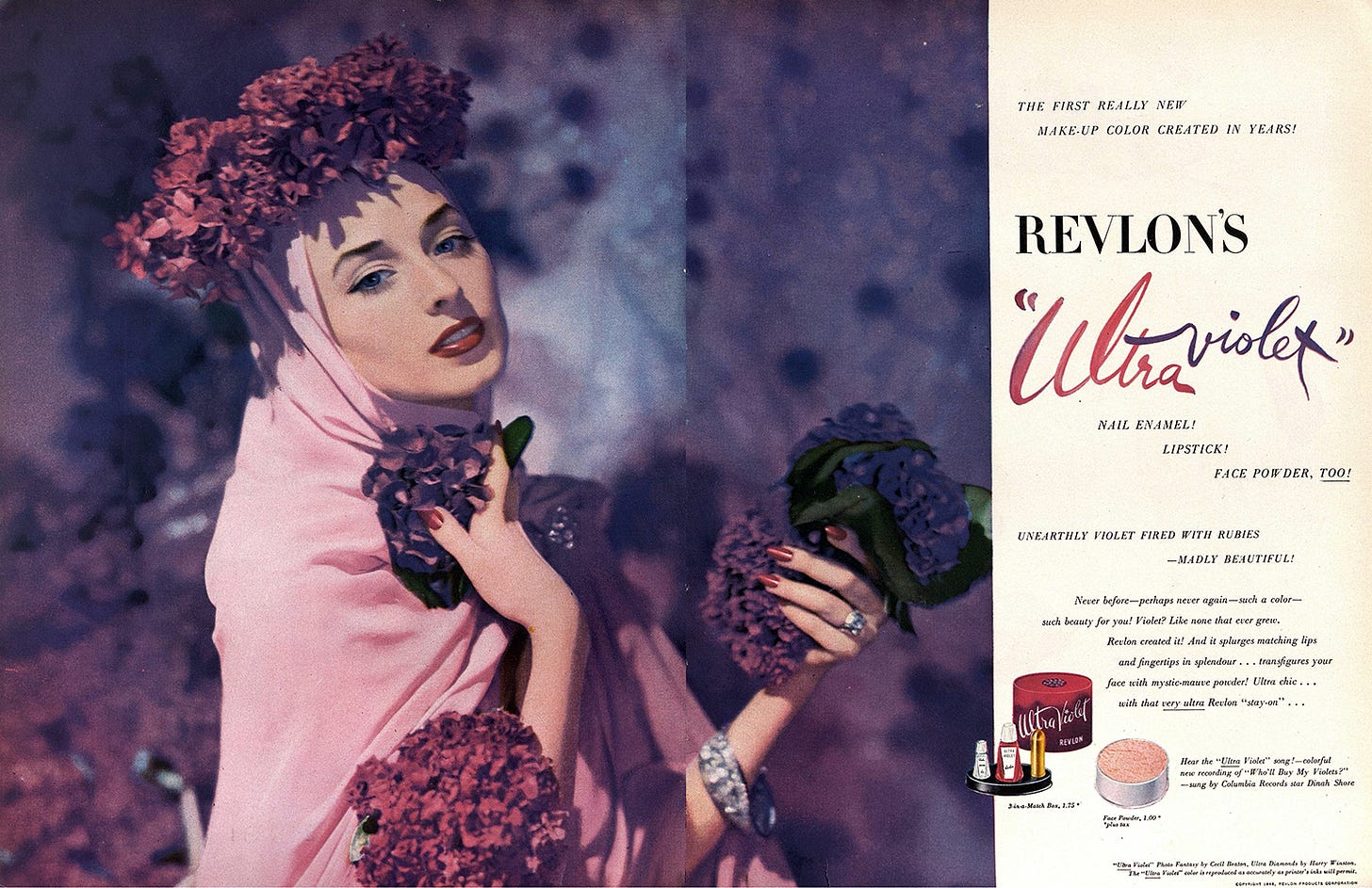
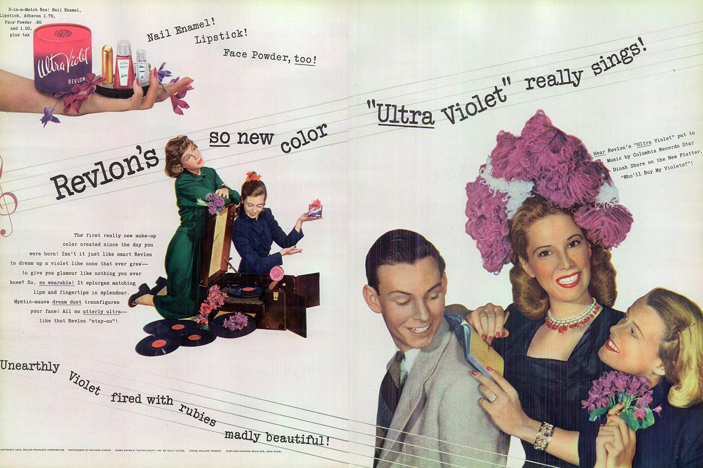
For the launch of Ultra Violet in October 1946, Revlon went even further—sponsoring the promotion of Dinah Shore’s latest record, “Who’ll Buy My Violets,” so that whenever it was played on radio or TV Revlon’s new color was mentioned. Engineered by McCann-Erickson, the advertising company of both Revlon (at the time—they were notorious for changing agencies constantly) and Columbia Records, the campaign cost them $200,000 and $100,000 respectively. Cecil Beaton created a “photo fantasy” for the ad, complete with piled-on Harry Winston diamonds. An “unearthly violet fired with rubies,” the color was launched at a cocktail party at the Ritz-Carlton, with fashion collaborations including costume jewellery by Coro, millinery by Sally Victor, handbags by Josef, and costume flowers (huge faux lilac corsages) by Dulken & Derrick. Subsequent color promotions like Cinderella’s Pumpkin and Sweet Talk had similar fashion tie-ins and promotional displays but lacked the musical crossover of Ultra Violet (perhaps Dinah Shore’s song didn’t have quite the success they desired?)
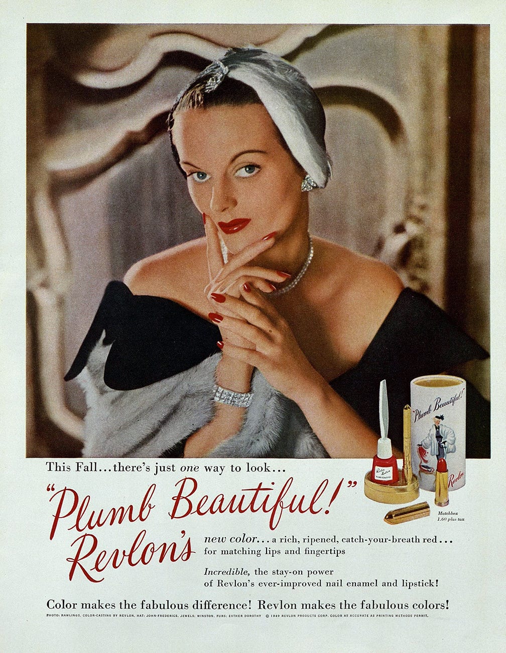
Plumb Beautiful, available in both “a rich, ripened, catch-your-breath red” and a lighter pink, came out in fall 1949, presented in sumptuous fur-filled windows at Bergdorf Goodman. They also showcased a ready-to-wear original taffeta dress in the same red. The following year, Revlon launched its new color with an unexpected full-page teaser ad in the New York Times. In the words of Andrew Tobias, “Smoke was curling from the burning edges of a hole in the center of the page. At first glance, the hole and smoke looked real. The headline was WHERE’S THE FIRE? And that’s all. No Revlon signature, no copy, nothing.” The teaser worked to gain attention for Where’s the Fire?, described in other ads as a “sultry, smouldering red – TNT for two!” In what would become an important concept in their next big promotion (and had been earlier used for Fatal Apple), Revlon’s copy played with the idea of a woman’s duality and on makeup’s previous negative connotations by daring woman “to be more sinner than saint” by wearing Where’s the Fire? With red lipstick and red nail polish no longer signaling that one was a “lady of the night” (in large part to Revlon’s class-focused advertising), ads like these invited women to playfully flirt with the dark side without affecting their reputation.
With each promotion in the 1940s and 50s, Revlon went from strength to strength—the names of their shades well-known to anyone who opened a newspaper or magazine, or who ventured into a department store. Revlon was both aspirational and obtainable—promising class, beauty, glamour and sex with the swipe of an applicator brush.
Originally I had planned to include Revlon’s next and most famous color promotion in this newsletter, but to do so I would have had to cut most of the ads. I’ve split it up, with the story of Fire and Ice coming in a few days.


