


Red Hearts & Red Lips: A Very Paper Moon Graphics Valentine's Day
Who Said Romance is Dead?

“Roses are red. Violets are blue. But you won't find this stuff on cards that are new. Trendiness has no place for pansies and prose. Today's style is — anything goes. And so it goes with the greeting card industry. Cards bearing hearts and flowers may still be on the shelves, but the hottest-selling cards reflect anything from a punk rock album cover to a Betty Boop cartoon.”
– Rochelle Koff, Fort Lauderdale News, August 21, 2979.
With the arrival of mass-produced Valentine’s Day cards in the late-nineteenth century, too came ideas about how such a card should look: elaborate die-cut cards with lacey cut-outs, colorful intricate illustrations, and usually a rhyming message of regard. Historically, Valentine's cards started to change in the 1960s as card companies sought to commodify the peace-and-love messages of hippies and flower children, while the next decade “experienced an attempt at added awareness of feelings, and cards were in the Rod McKuen vein, with lots of seagulls and sunsets.” In the late 1970s, it had become apparent there was a greeting card “market waiting to be tapped. Mass marketing offered no alternatives to the hearts-and-flowers school… Some highbrow stuff was available through places like the Metropolitan Museum catalogue, or special interest sources like the Smithsonian or Audubon Society, but they represented a very small share of the sales. Most people still trotted to the corner drugstore for a Hallmark. Many were satisfied with the traditional big $1 lace-encrusted sentiment, or a Peanuts card…” Paper Moon Graphics stepped into this void, and as the “grandaddy of the new wave” of greeting cards, revolutionized not only Christmas cards—as I wrote about in December—but also the overly saccharine world of Valentine’s cards.
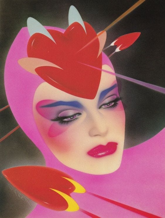
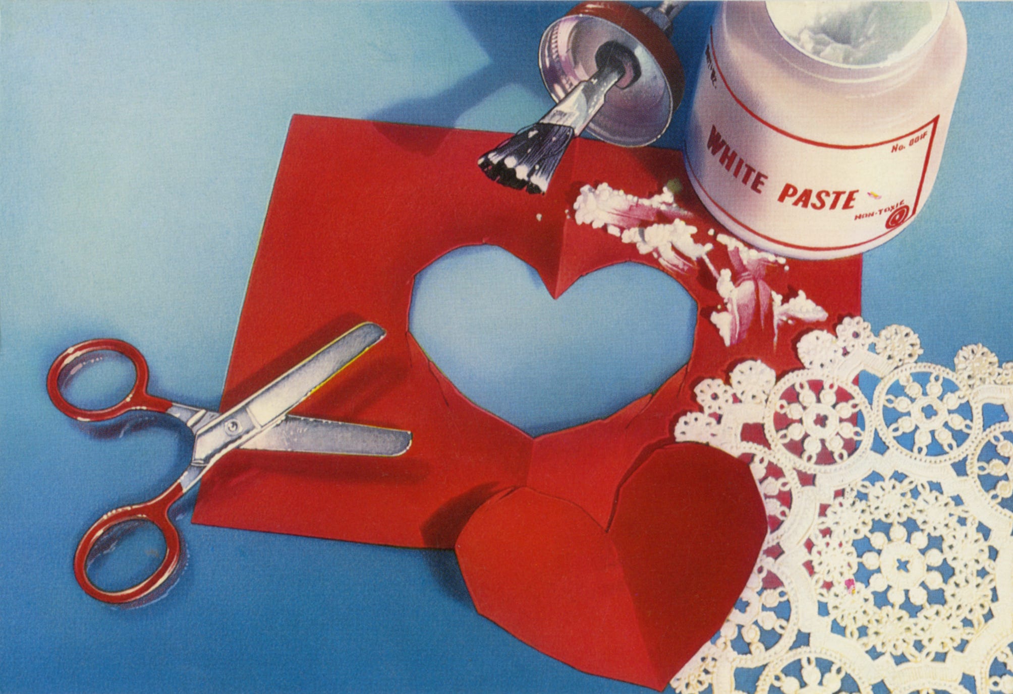
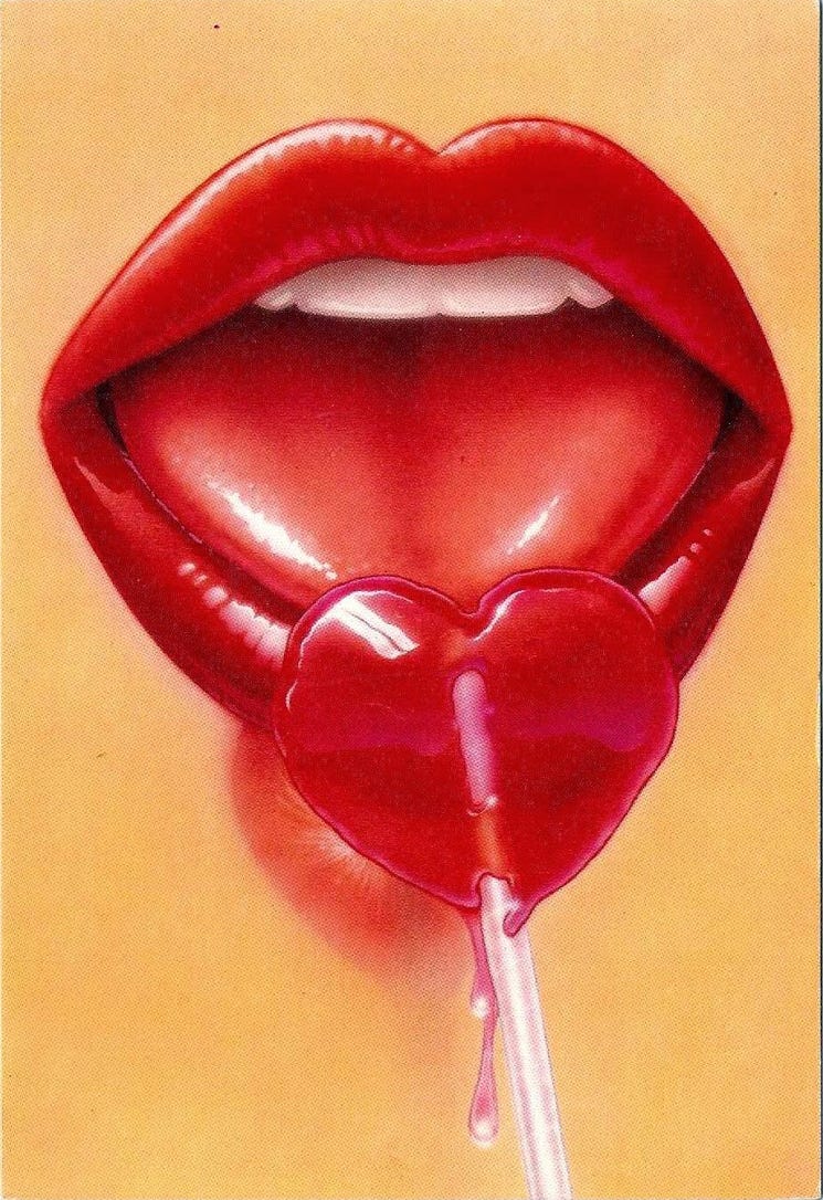
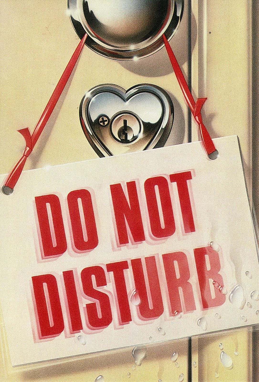
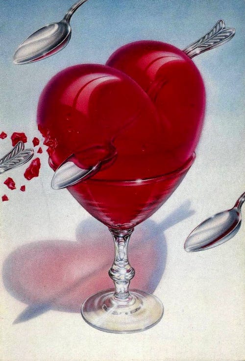
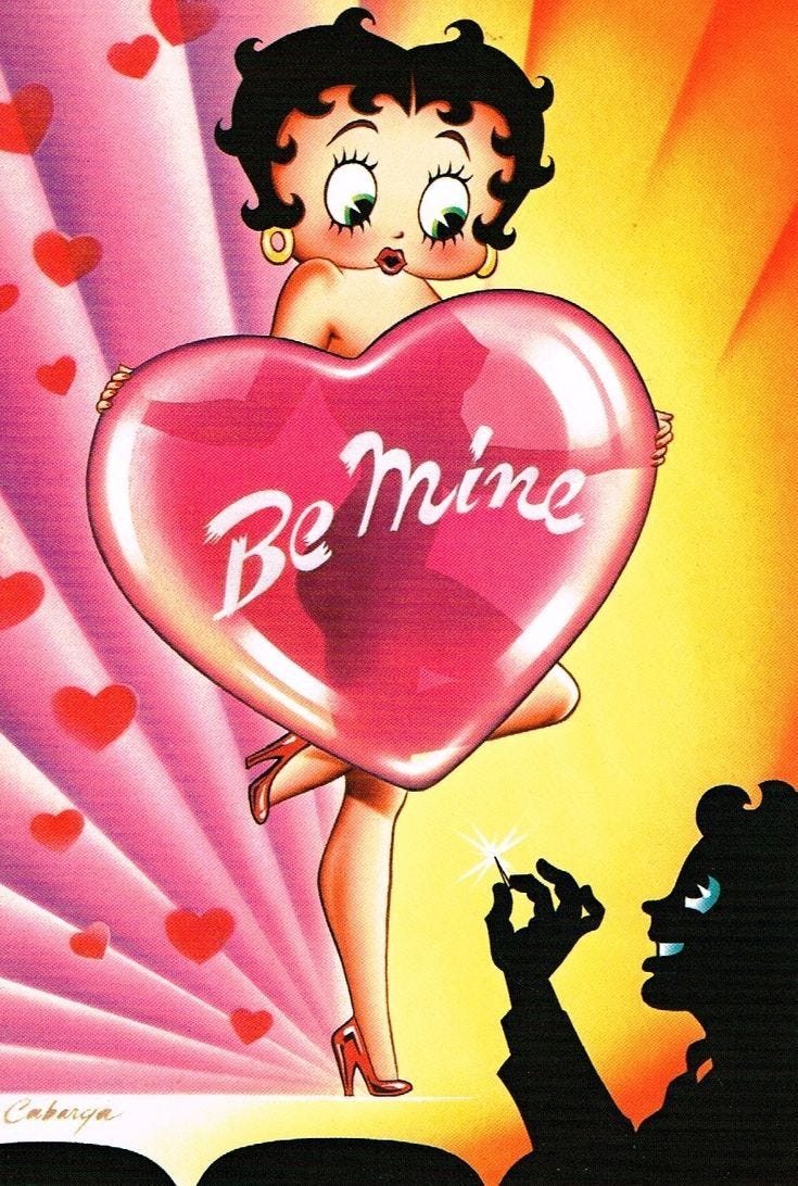
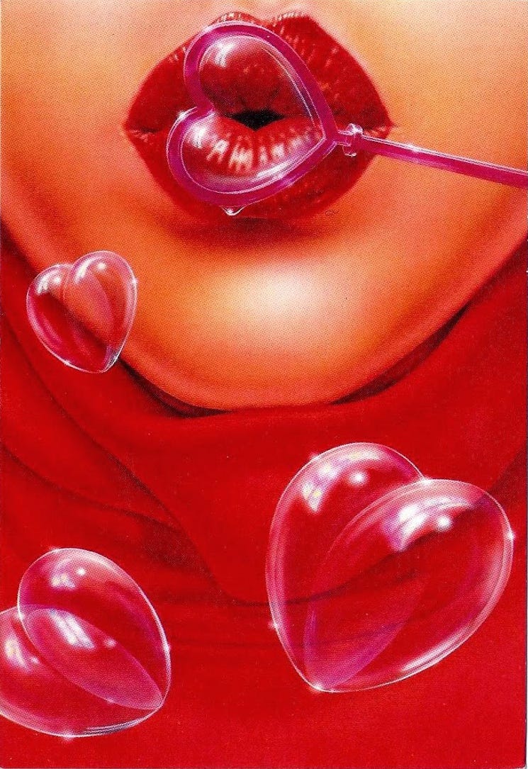
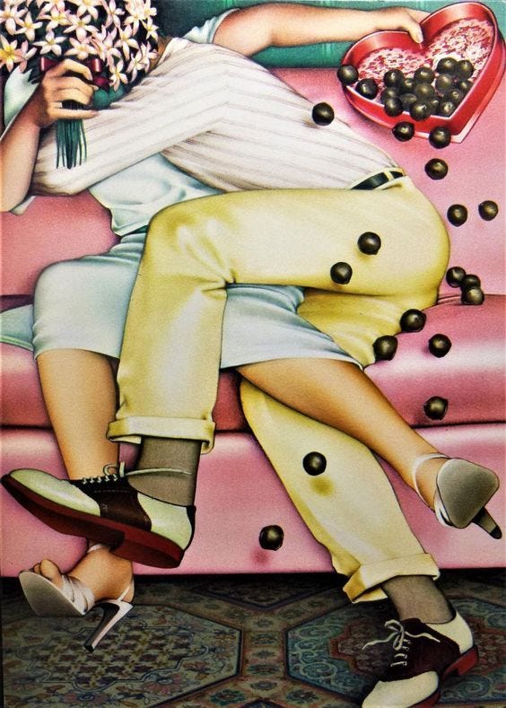
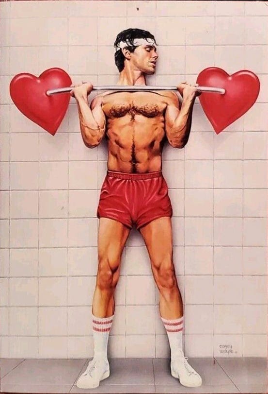
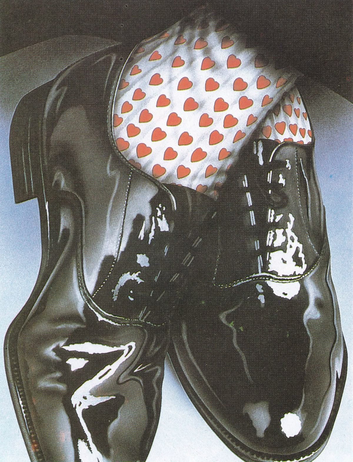
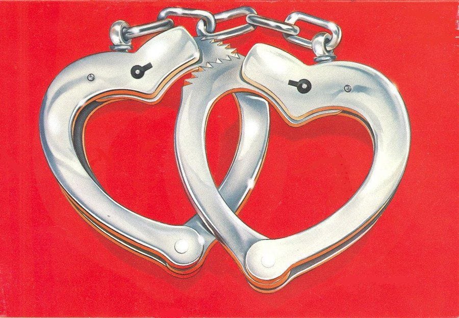
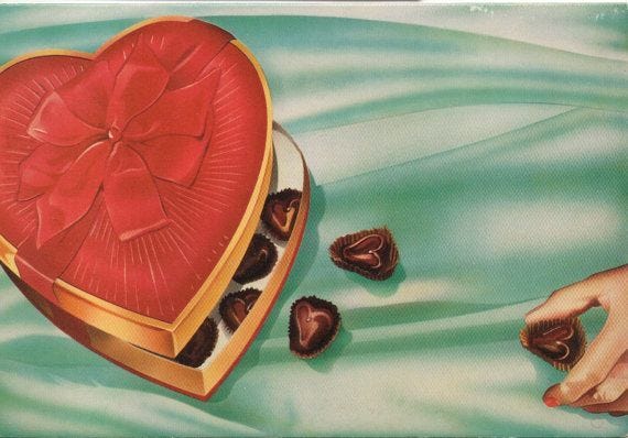
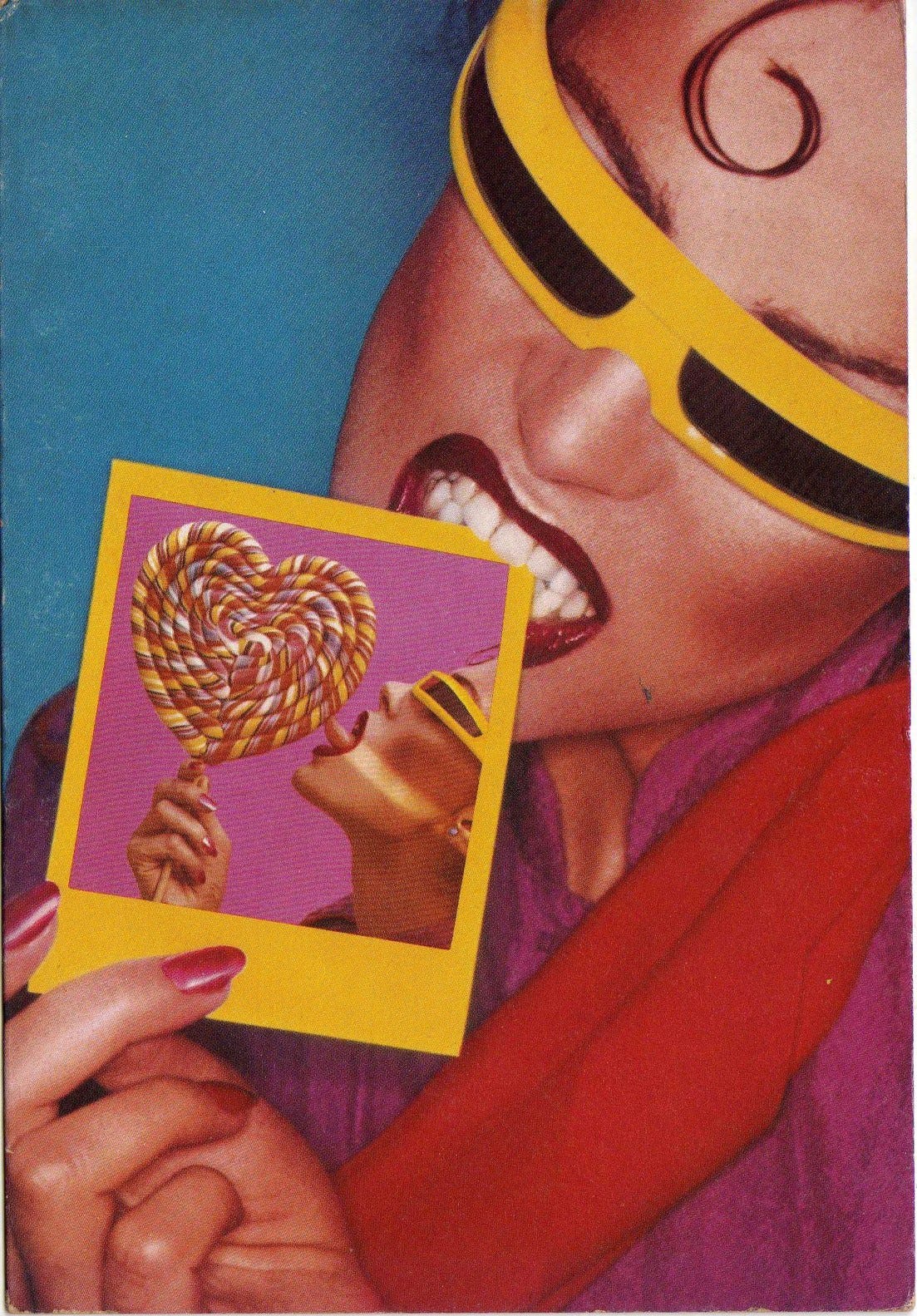
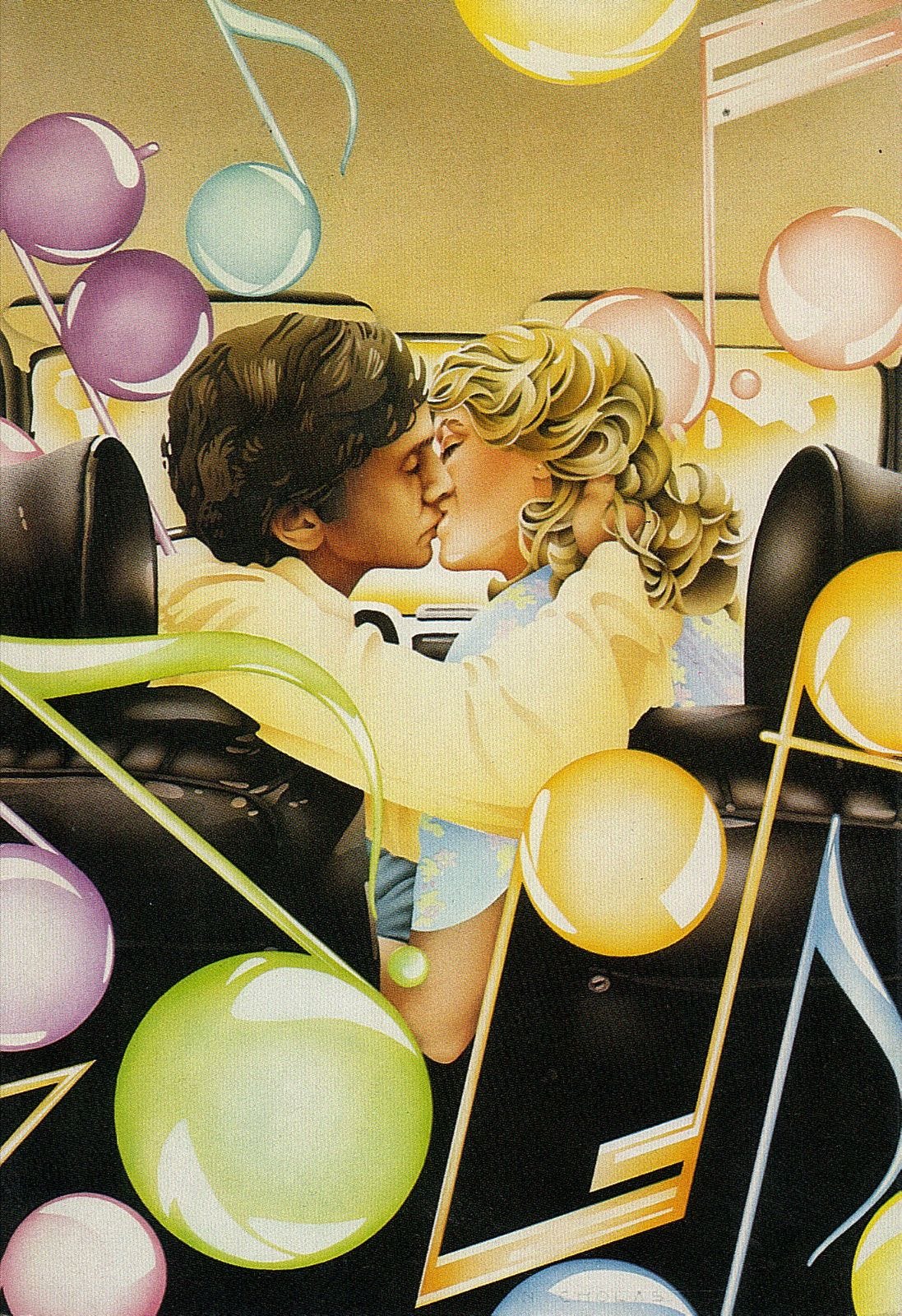
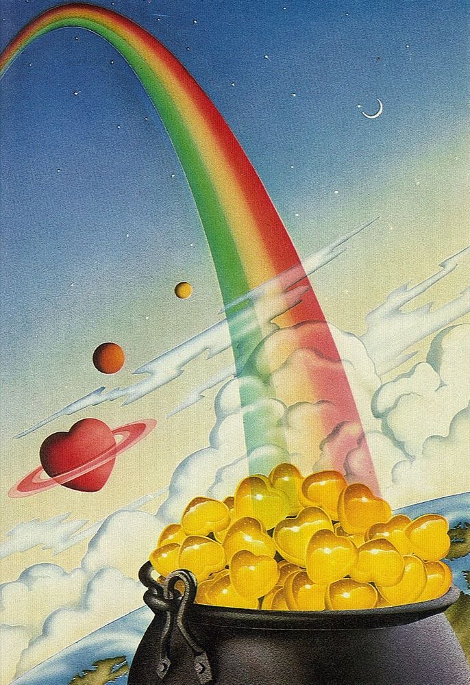
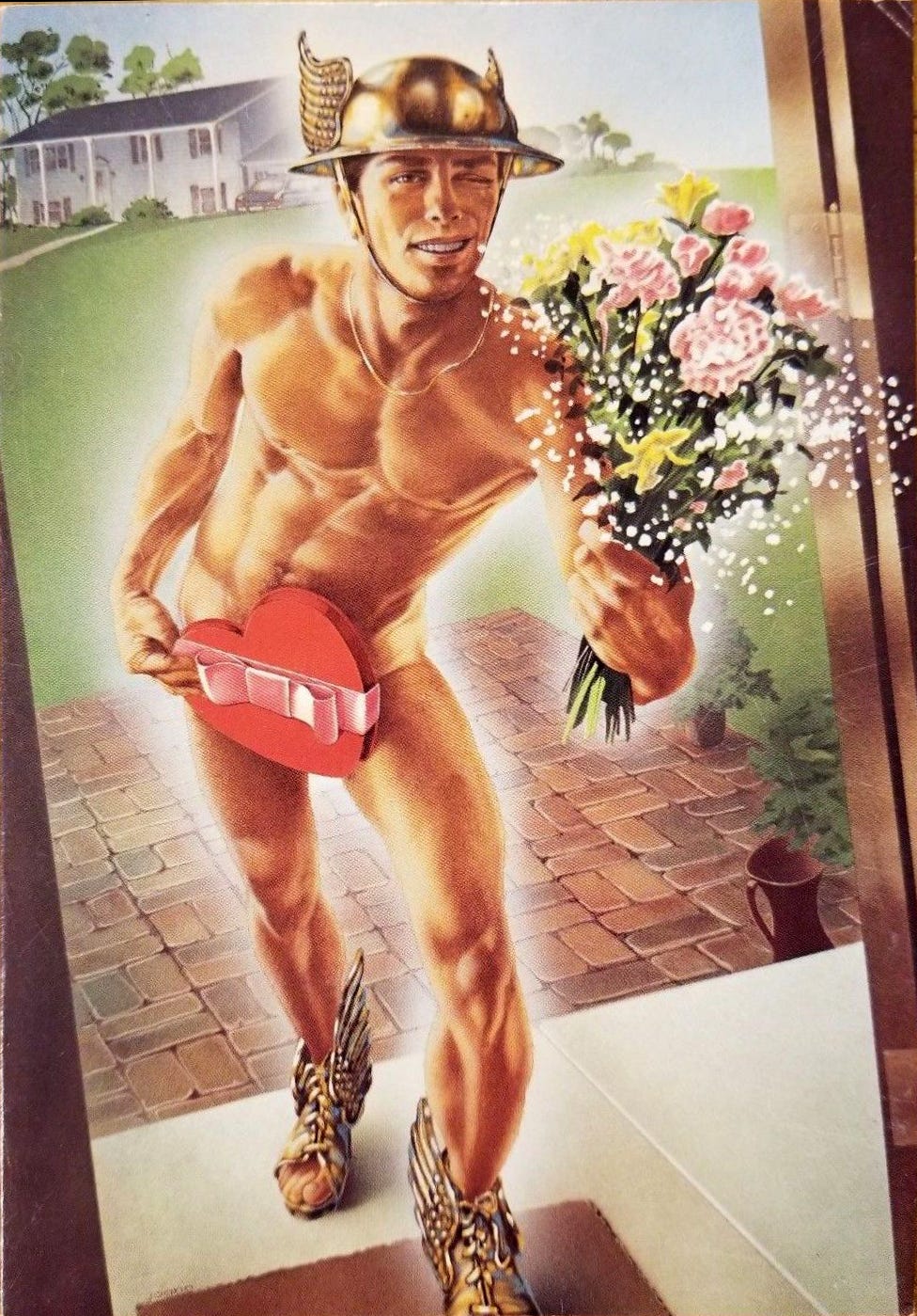
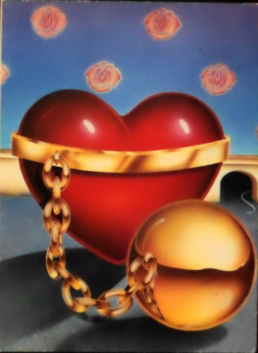
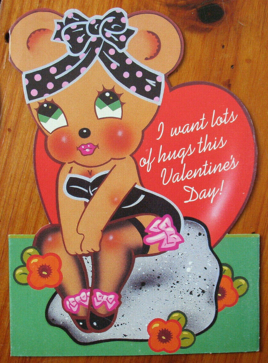
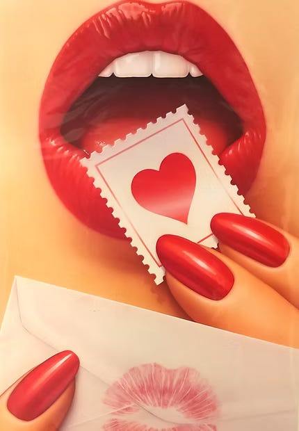
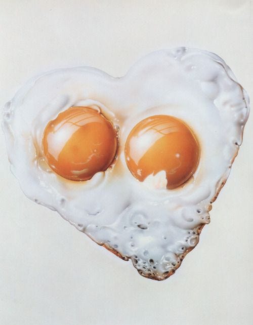
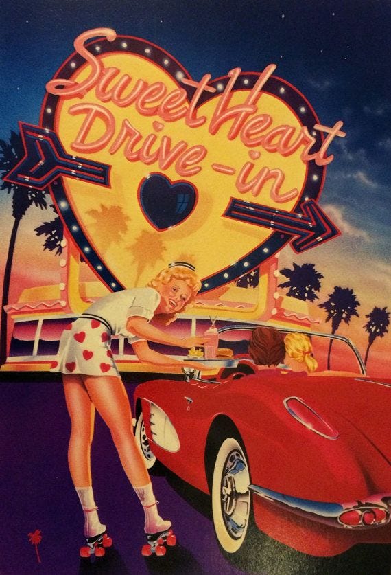
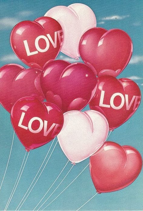
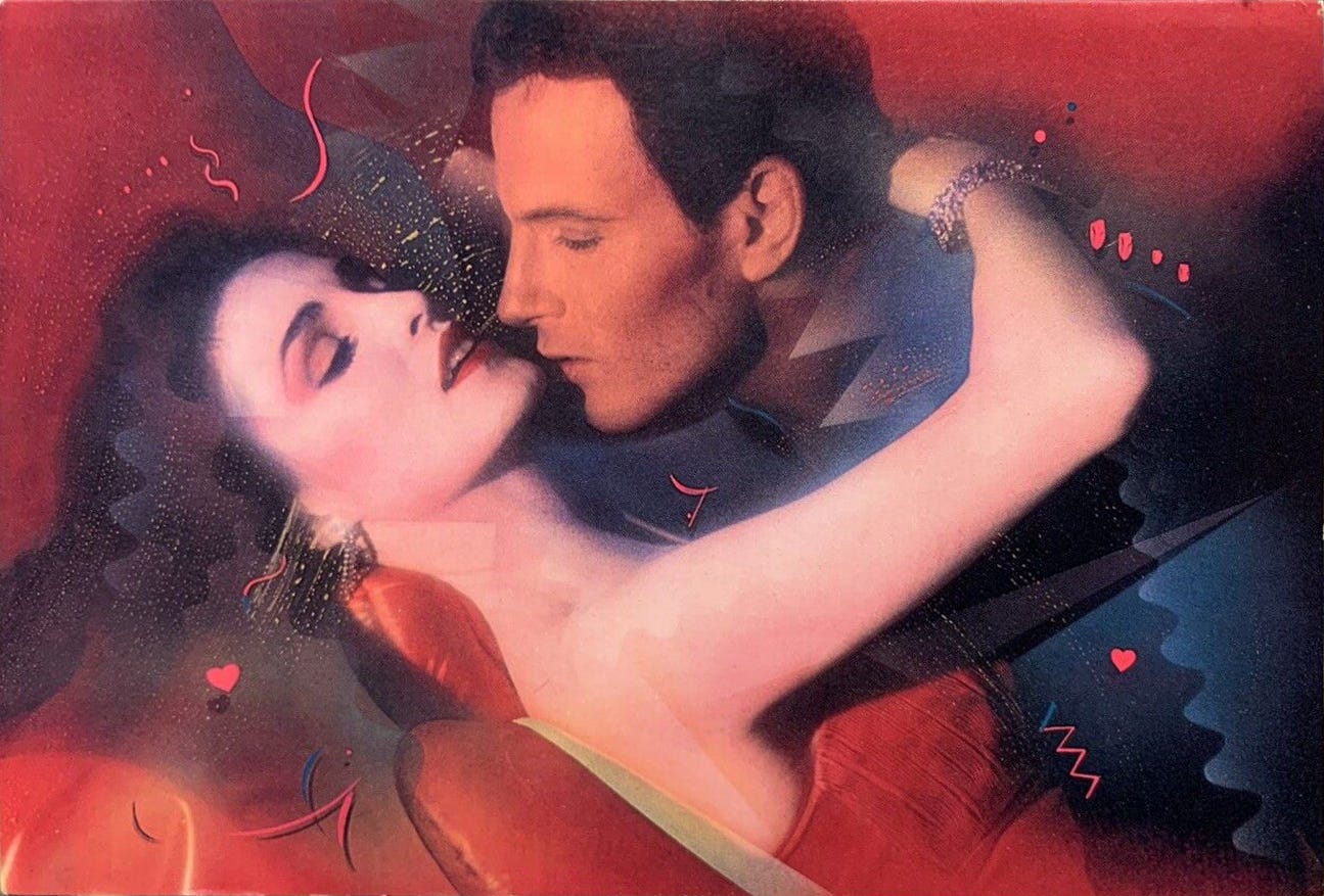
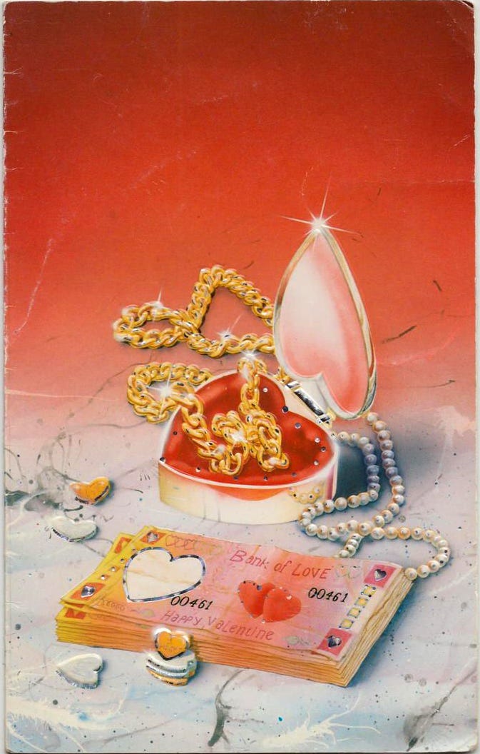
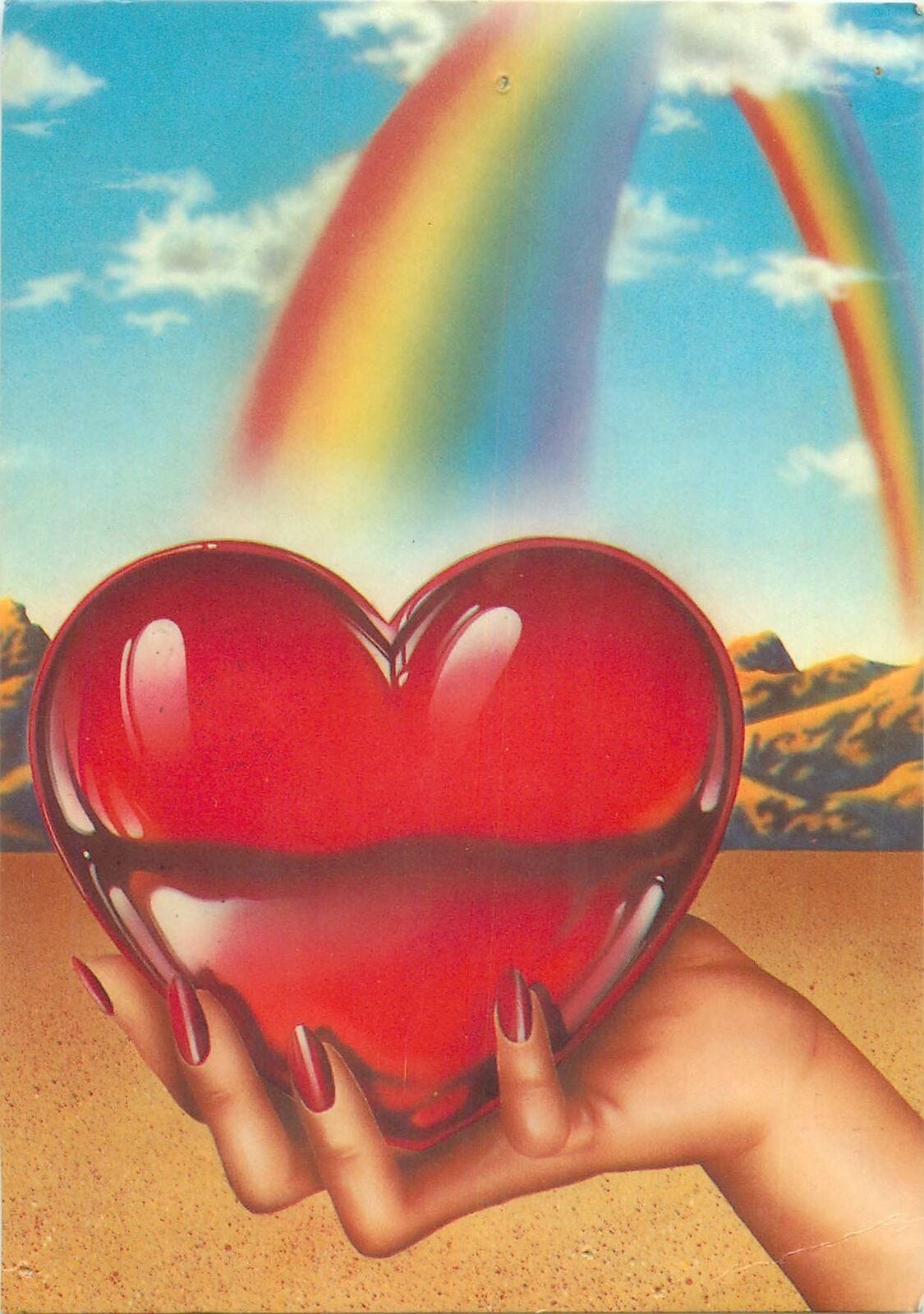
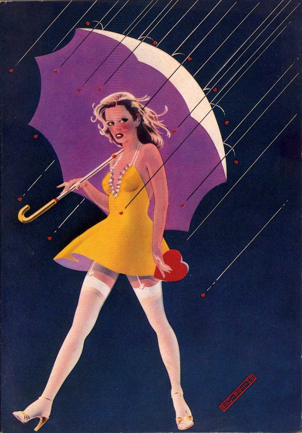
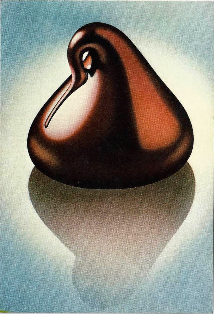
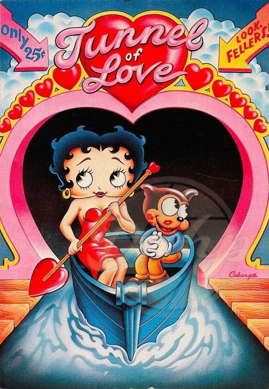
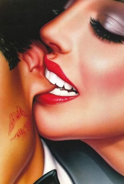
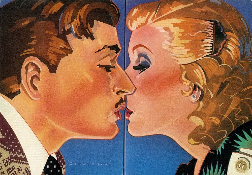
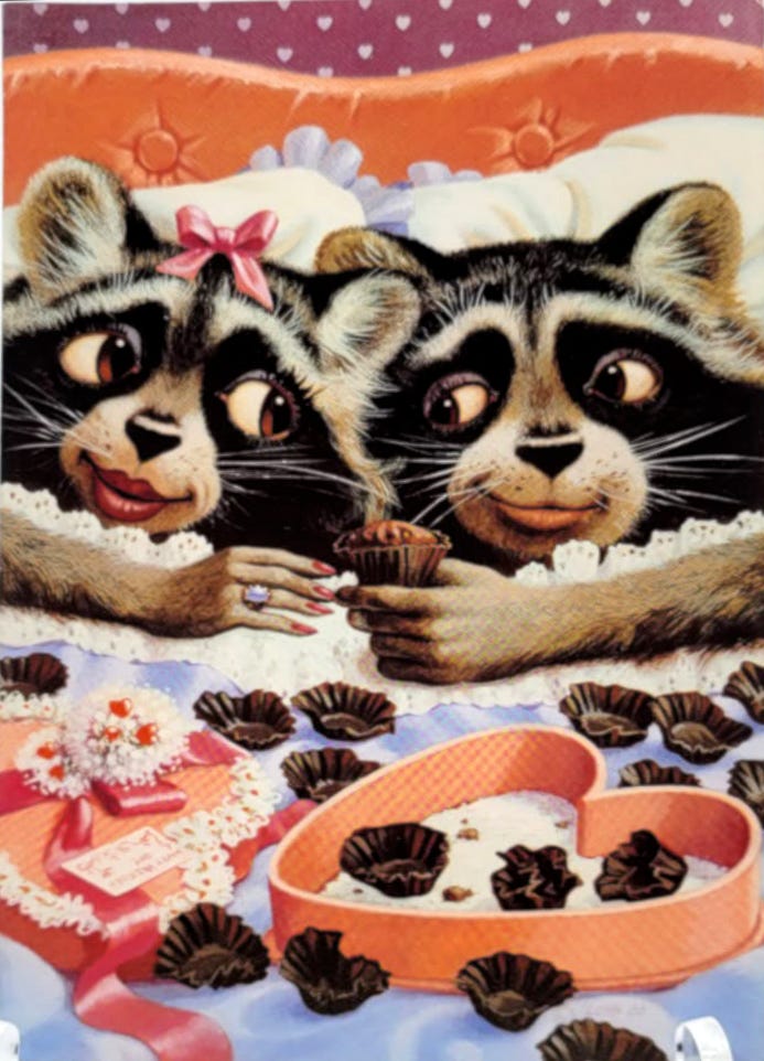
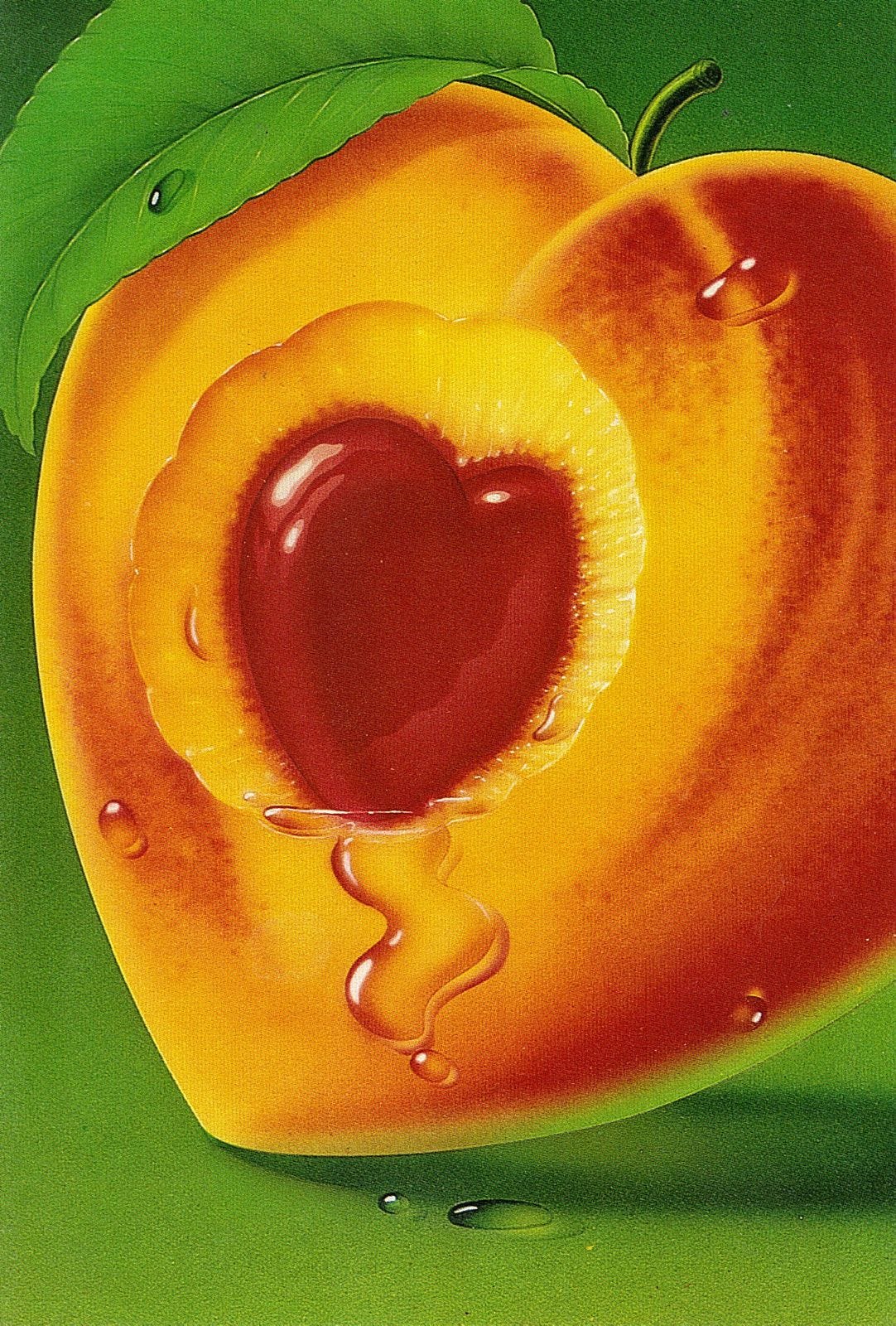
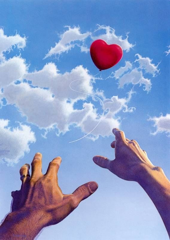
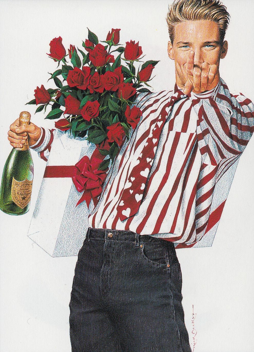
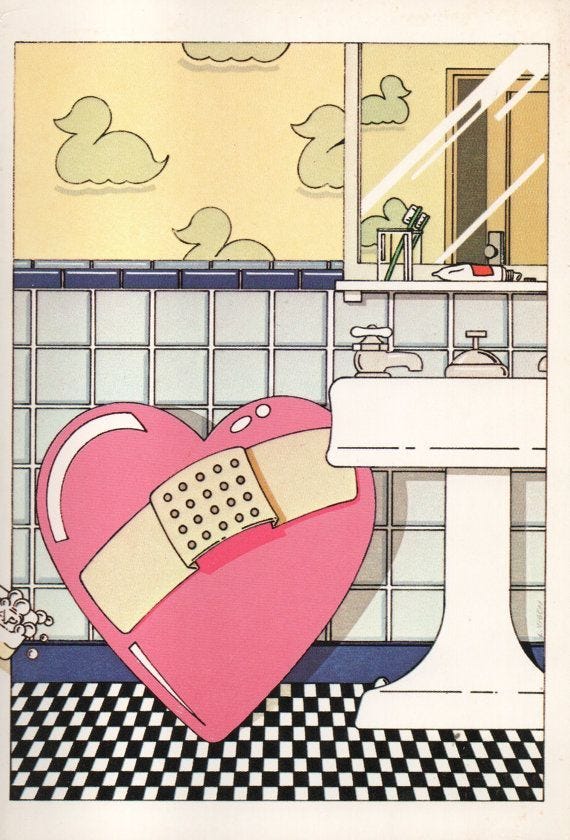
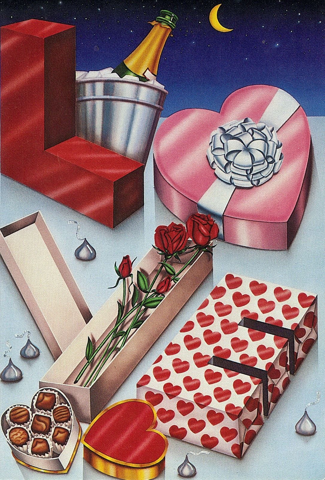
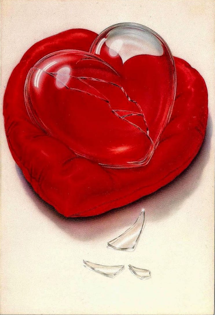
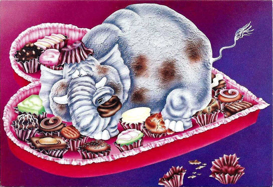
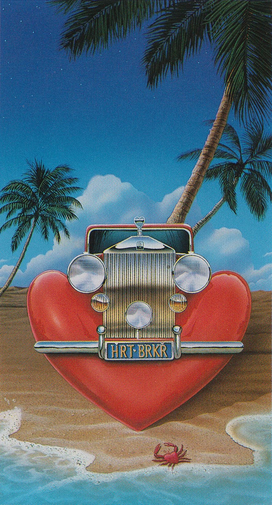
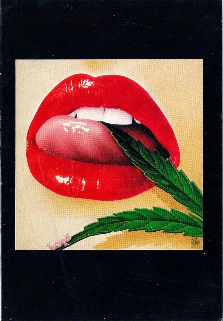
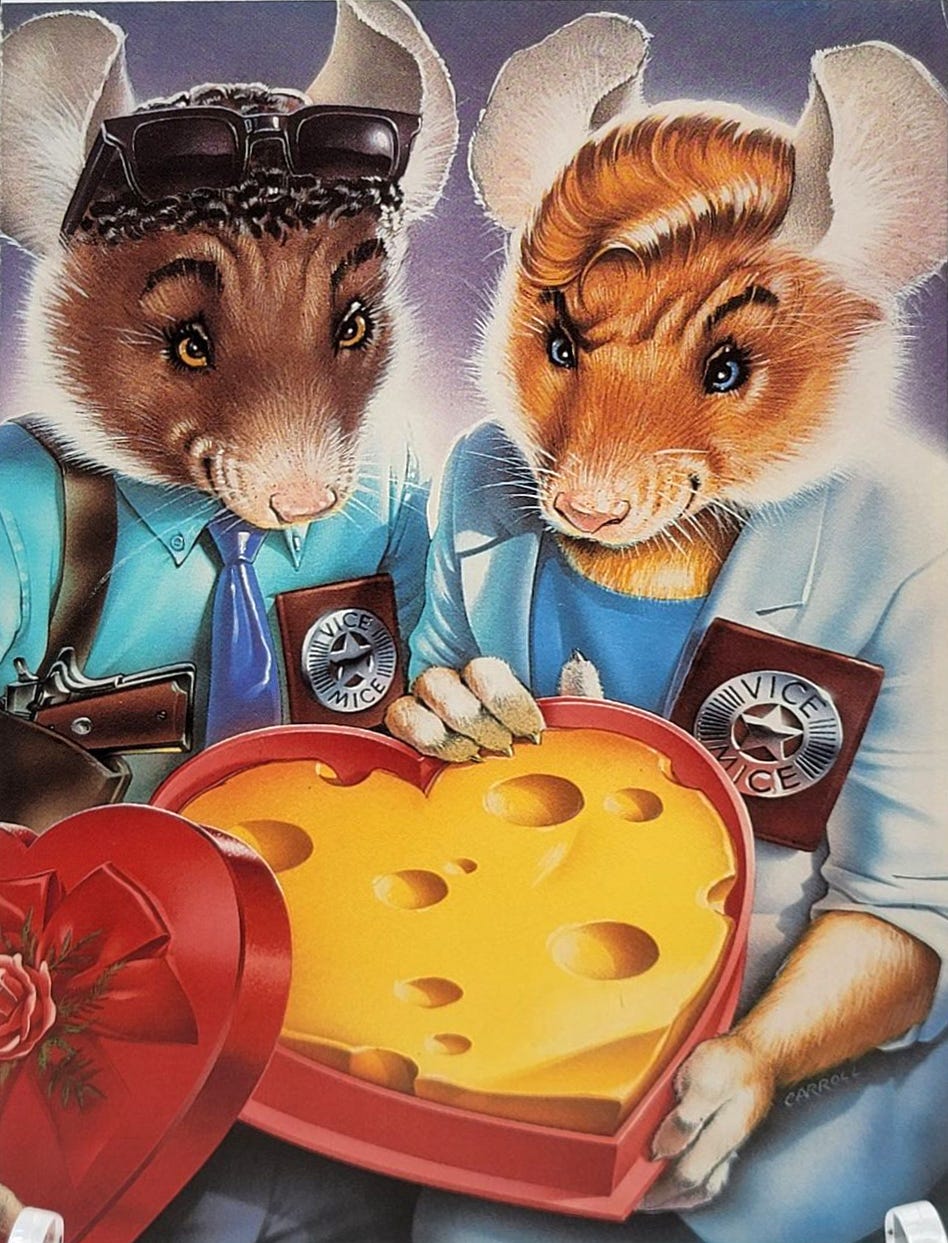
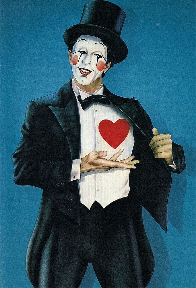
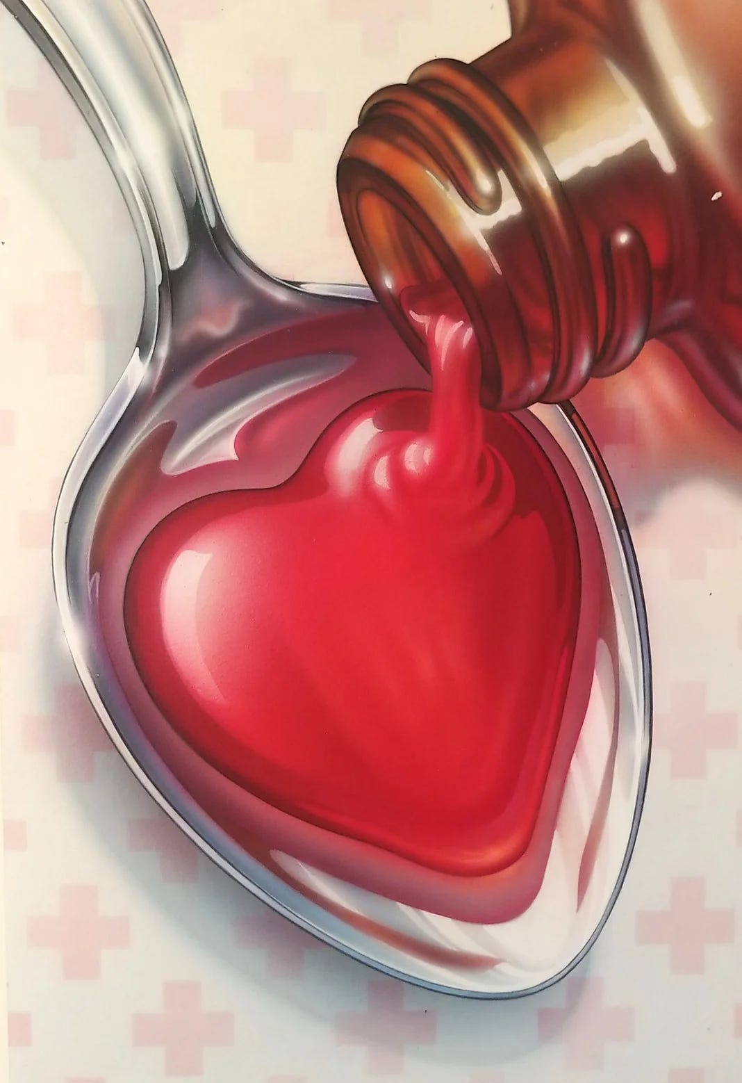
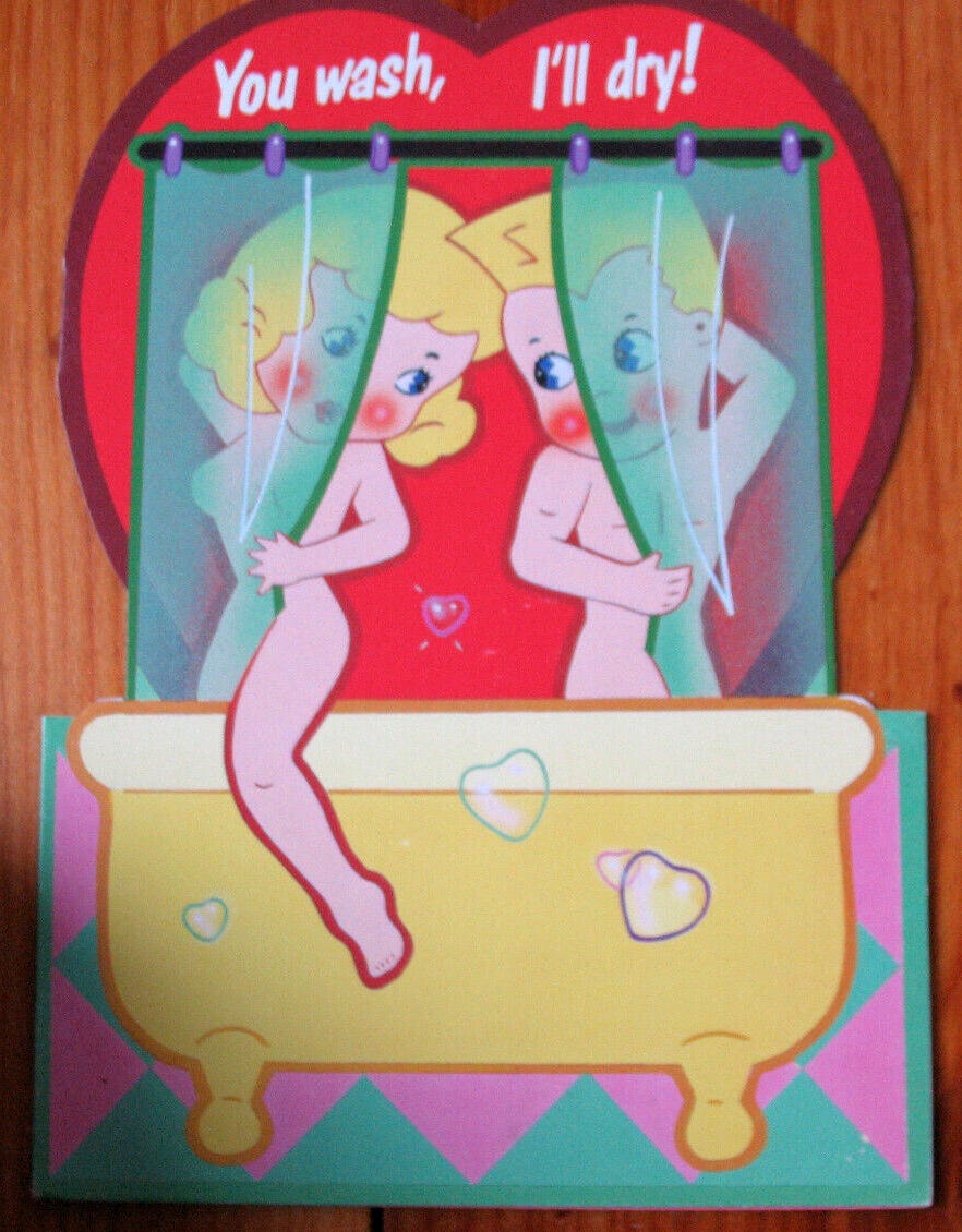
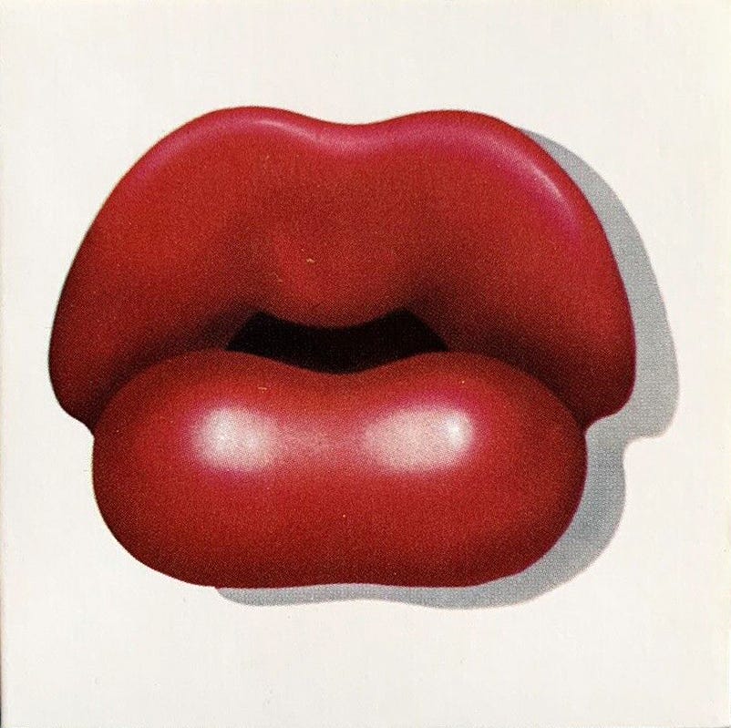
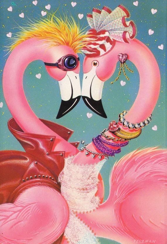
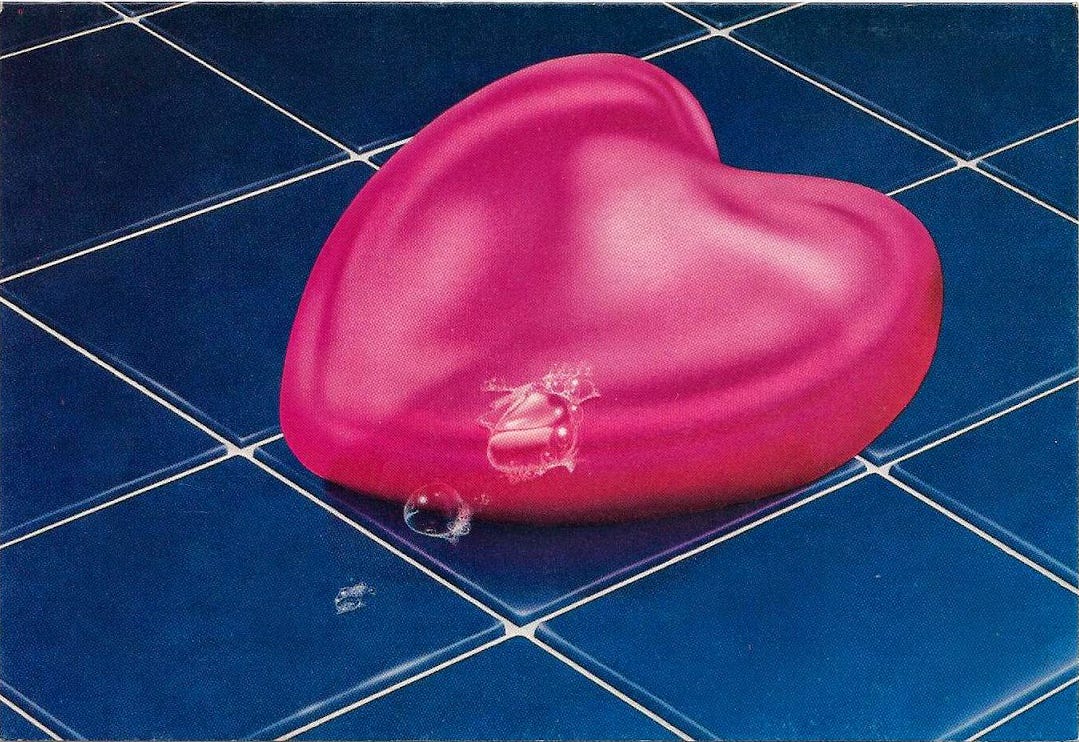
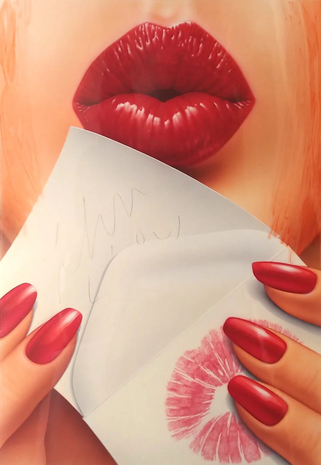
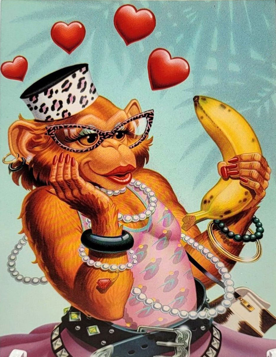
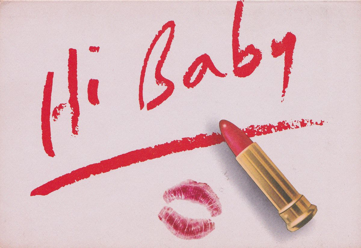
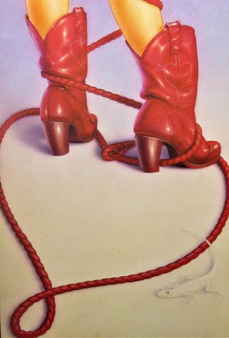
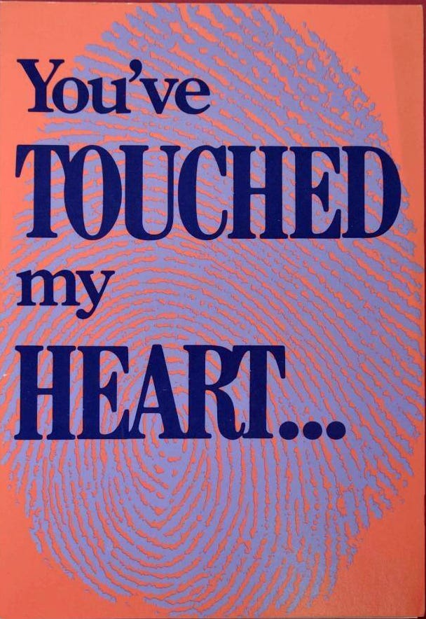
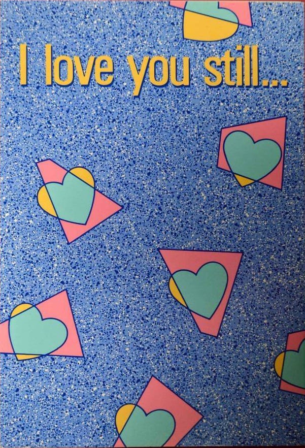
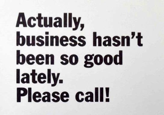
Paper Moon Graphics’ Valentine’s Day cards, as you’ll see below, were a retro kitsch explosion that teasingly played with the common holiday tropes of hearts, chocolates, kisses and lips. Once out in stores, Paper Moon’s bold acrylic or airbrush style with nostalgic motifs was so unlike anything else that they became instantly recognizable and highly coveted—and widely copied. Within a few years, the paper goods industry and audience had ballooned with many smaller stationary, card, and gift shops opening across the United States that advertised Paper Moon cards alongside such diverse items as afghans, neon or soft sculptures, “Austrian prisms,” and shells. By 1981, PMG’s president Fred Zax told the Detroit Free Press, “There’s been a renaissance in the nature of the greeting card. The things you can do with graphics are open ended.” Not everyone loved them though—LA Weekly described them as “nauseating new wave air brush kitsch” in 1982.

“Stock up on special Valentines before the best are snatched up. Paper Moon Graphics win everyone's heart with the best Valentine cards around. No cupids languishing across the front of the card with syrupy accolades oozing from inside. Paper Moon's artwork gives a clever twist to Valentine nostalgia, and the inside is blank for you to write what your heart desires.”
- OK Magazine, Tulsa World, January 27, 1980.
Unlike many of the companies that sprung up in their wake, PMG did not rely on punchy taglines or puns inside (though their cards sometimes had them, scroll to the bottom to see one group of inner quips)—Paper Moon cards stood out due to the “arresting colors, high-quality reproduction and unusual images, like cabs or stars or lips.” The emphasis on image over word led PMG’s French distributor to call the cards “the first form of purely visual communication in thousands of years,” while Dennis Green, president of competitor Metagraphics, admitted to the press that, “The blank cards are for more self-expressive, more educated consumers who know what they want to say. For this person, the image makes the statement. It’s very personal.” David Fu, the owner of a greeting card store in Greensboro, felt that the shift to blank cards showed that, unlike the 1970s where emotions had to be spelled out, “People are more aware of their feelings and can express themselves more.” Whether or not consumers were truly more in touch with their feelings, Paper Moon’s bold imagery and lack of sentimentality provided the perfect canvas for declarations of love and lust with a heavy dose of irony, nostalgia, and camp.

For a short history of Paper Moon Graphics, read my newsletter “A Paper Moon Christmas: The Ultimate in Vintage Holiday Cards.” The Strong National Museum of Play put together a fun history of Valentine’s Cards for Google Arts & Culture.
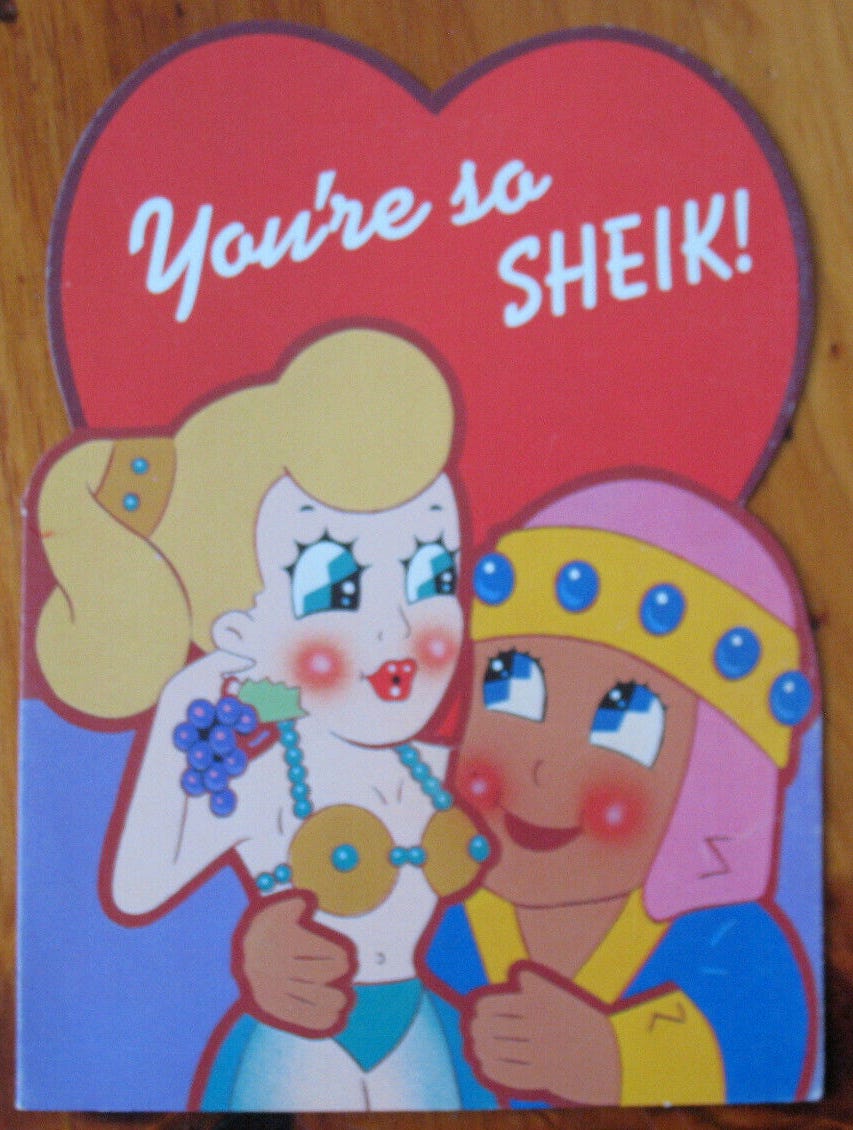
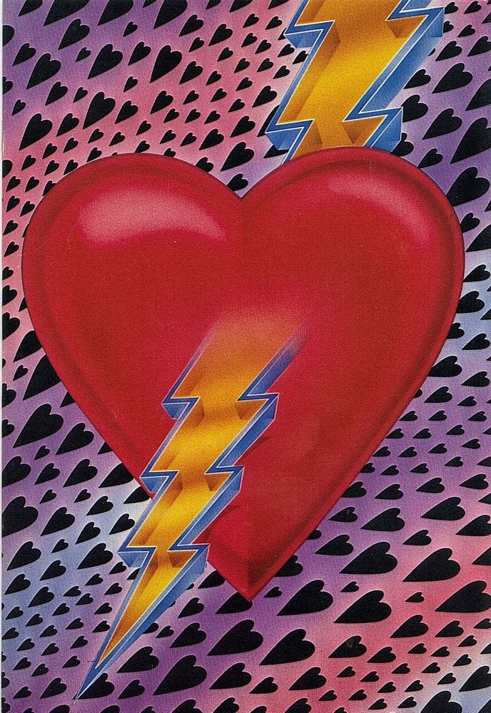
Below is a huge collection of Paper Moon Graphics Valentine’s Cards—some of these were sold year-round for general love and lust purposes. I have credited all I know with artist and year; if you can fill in any of the credits, please let me know.
This is way too long for email so look at this in your browser for max <3 holiday inspiration.
Next time you send a friend a note, leave the stenographic paper in your desk and the rose scented velum stationary to grandmother, and write your heart out on a card by Paper Moon Graphics.
The cards are blank inside, but their covers are funky take-offs on art trends from pin-up girls to surrealism (Betty Boop and Kewpies, too).
- Maridel Alinder, OK Magazine, Tulsa World, November 6, 1977.


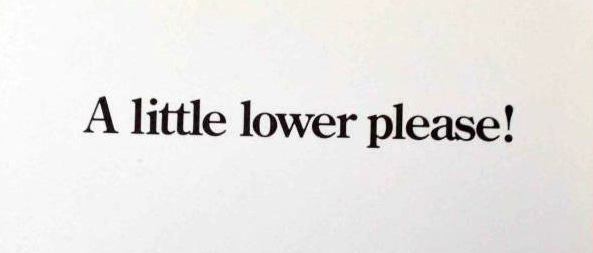
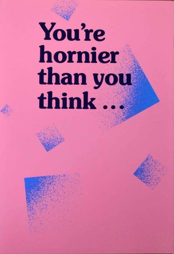
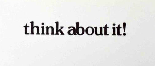
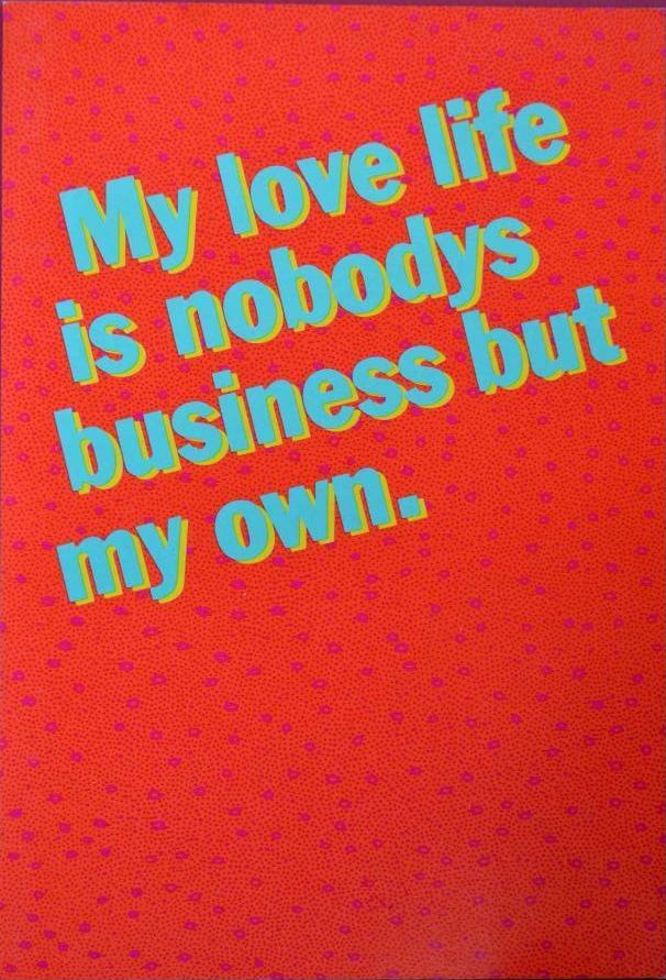
And some cards and their inside quips from Paper Moon Graphics’ Quiplash line, 1985:
A Paper Moon Christmas

“Paper Moon, a mere slip of a card company, has swept the country and parts of Europe like stardust.” – GQ, February 1979
How Do I Love Thee? 💗💗💗

I’m writing this as the snow falls outside. It is perfect romantic weather – ideal for cozying up with one’s love next to a fire—the stuff of novels and movies and poems and fantasies.
The Romance of Food

With Valentine’s Day coming up next week, you might be looking for a menu that tempts all of the senses, soothes, and seduces—and where better to find one than from "the true Queen of Romance", Barbara Cartland?
The Perfume of the Gods

In an age where every celebrity and influencer has a beauty line and perfume, the expansion into products is almost expected—simply the next step in the amassing of fortune (or in expanding the grift, depending on how you look at it), no matter if the star in question is known for their skin/makeup looks/beauty/etc. Perhaps that’s why it’s so interesting to read the press’s reaction to the announcement of a Barbara Cartland perfume line back in 1981, as it shows just how far we have come—celebrity/influencer lines are the expectation, not the exception.
The valentines are incredible, but I had missed the Xmas post, and wow, the imagery is such a core root to my 1980s southern California childhood that it's palatable. Seeing them all in one place was a wild feeling.
As a side thought, these posts made me wonder if, in a diagram of illustrators working during this period, how many were doing work with Paper Moon and Harlin Quist... def aesthetic overlap at the very least.
Fun stuff! Makes me think of Mel Ramos.