


The Textural, Colourful Delight of Dorothy Liebes

As the director of the Cooper Hewitt, Maria Nicanor, writes in the foreword to A Dark, A Light, A Bright: The Designs of Dorothy Liebes, “Liebes may be one of the most groundbreaking designers many people today have never heard of. Liebes’s role in modern design in the United States, from the 1930s and until her death in 1972, was monumental, and yet, her story hasn’t been fully told.” Hoping to rectify that, on view at that museum now is an exhibition of the same name, which vividly draws visitors into Liebes’ design world. Those heavily textured, often brilliantly colored and shot with metallics fabrics that we associate with midcentury America? That’s all Dorothy. In fact, this style she originated became so well known that it was called the “Liebes look.” In the introduction, Alexa Griffith Wilson continues, “Few people exerted a more powerful influence on the textures and colors of modern American interiors, industrial design, and fashion in the twentieth century.”

Liebes’ work is so beautiful, especially in person, that during my visit to the Cooper Hewitt last week I was completely spellbound. Her beloved Lurex sparkles, drawing one closer to the swathes of luminously shaded textiles. Textiles, swatches, and sketches share gallery space with furniture, clothing, and archival photographs—there is even a loom and yarn wall recreating her much-photographed studio.


In demand as a textile designer for both home and fashion, Dorothy worked with many of the greats of the day. A skilled businesswoman, she was equally adept at creating custom draperies and upholstery for the likes of Frank Lloyd Wright, Donald Deskey, and Raymond Loewy (who I’ve written about before here and here) as collaborating with mass-market manufacturers of fabrics, wallpapers, and home goods—she even designed upholstery fabrics for Chrysler and American Airlines. Her appearances as a design guru in magazines, ads, and on TV and radio gave her the kind of name recognition that only Chip and Joanna Gaines have today (though with much more taste, style, and high-end clients). Her lushly textured weaves were favored by fashion designers like Clare Potter, Adrian, and—in particular—Bonnie Cashin. The pair were good friends, their shared aesthetic and mutual admiration aided them in becoming ideal design collaborators.


Flicking through the book just now, I came across this quote by Liebes from 1957: “When people don’t feel my fabrics, I am hurt.” While touching any of the museum-owned textiles would be an impossibility, it’s hard not to be filled with the desire to reach forward and rub her nubby, open-weave, and tufted fabrics. There is a sensual tactility to the yardage, drapes, blinds, ponchos, scarves, and cushions that invite touch—and a wish for designers today to take the same risks with colour and texture that Liebes did.


If you are a textile or weaving aficionado, this is a must-see exhibition—and if you can’t make it to NYC by February 4th, order the gorgeously printed monograph. I haven’t had a chance to read all the essays yet but the photos are scrumptious, particularly the close-ups of her textiles. I’ve included below many of my own detail shots of the fabrics, hopefully allowing Dorothy’s genius for the textural interplay between warp and weft to be seen, no matter where you are.


I would die for this skirt.


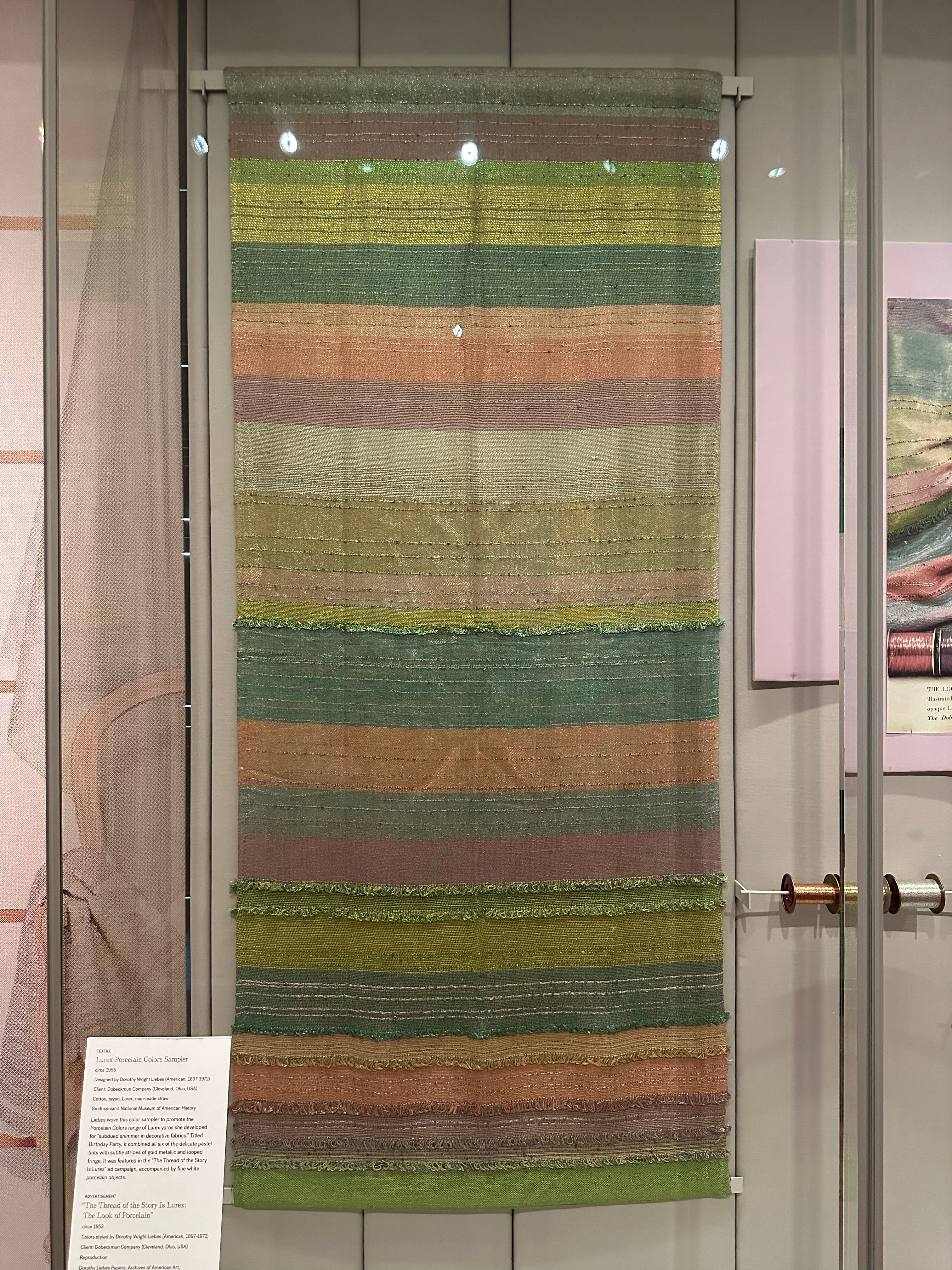
This textile can be seen hanging in the photograph above.

The above photo isn’t in the exhibition but it’s a personal favorite.


I would also die for this skirt.


A stellar exhibit and like you I wanted to TOUCH. Curators! Find a piece of Liebes in a dark colorway and let us go at it. “Feeling Station”. Too late, but next time?